
CSS Margins and Padding
Easy CSS Margins and Padding Guide: 4 Shorthand Rules & Examples
Master layout spacing with this complete CSS margins and padding guide. Learn 1-4 value shorthand syntax, margin auto centering, and margin collapsing rules.
Estimated Read Time: 20 Minutes | Category: Web Development Fundamentals
Overview: Understanding CSS Margins and Padding & Spatial Hierarchy
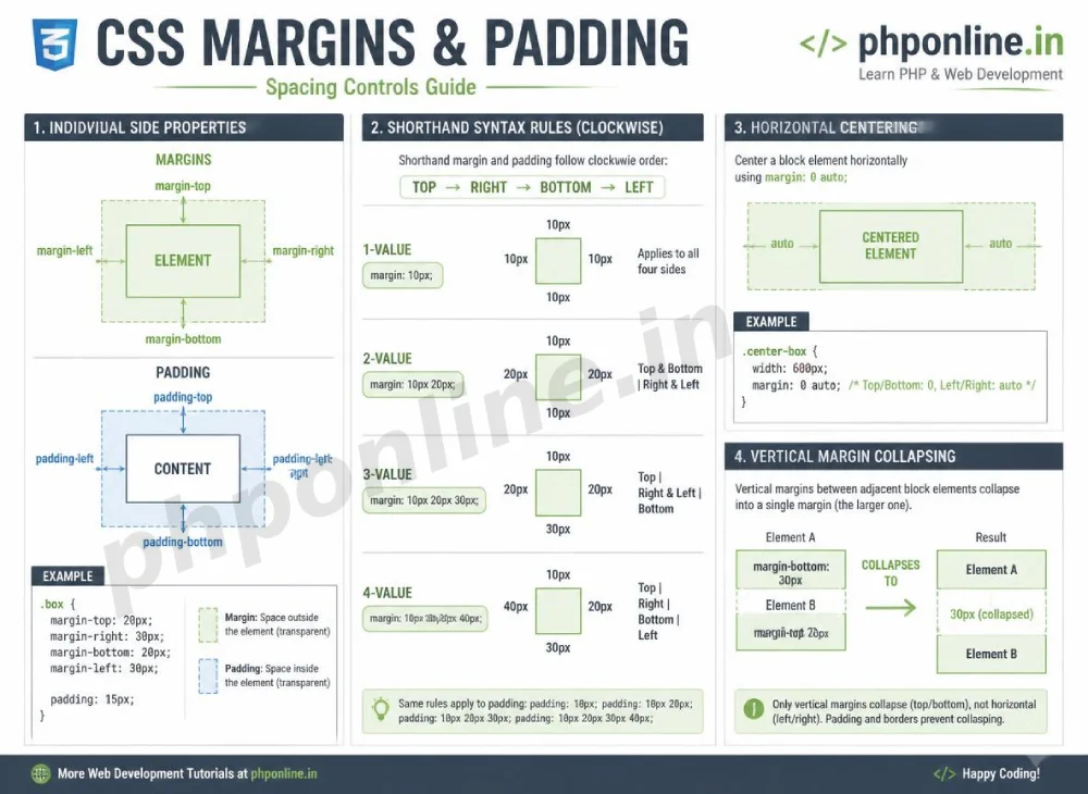
Quick CSS Margins and Padding Summary:
- Dual Spacing Controls: Margins and padding dictate the spatial rhythm of web layouts, controlling external gaps between elements and internal padding around text.
- The Core Structural Difference: Padding creates internal breathing room *inside* an element’s border, whereas Margin creates external whitespace *outside* an element’s border.
- Clockwise Shorthand Syntax: CSS provides shorthand syntax rules accepting 1, 2, 3, or 4 values evaluated clockwise: Top → Right → Bottom → Left (TRBL).
- Horizontal Box Centering: Setting
margin: 0 auto;on a fixed-width block element automatically centers it horizontally within its parent container. - Vertical Margin Collapsing: Top and bottom margins of adjacent vertical block elements collapse into a single margin equal to the larger of the two values.
Welcome to Lesson 6 of our structured Web Development curriculum. Following our previous lesson on Easy CSS Box Model Guide: 4 Core Box Layers & Examples, you now understand how content, padding, borders, and margins form the four rectangular layers of every HTML element. The next essential step in building polished layouts is mastering spatial control using CSS margins and padding.
In graphic design and typography, whitespace (or negative space) is just as important as the text and images themselves. Cramped layouts with tight text borders or uneven element gaps feel chaotic and unreadable. Proper utilization of margins and padding creates visual separation, establishes content relationships, and guides the user’s focus smoothly across the page.
In this comprehensive CSS margins and padding tutorial, we will explore individual side properties, 1-to-4 value shorthand rules, horizontal container centering, vertical margin collapsing behavior, negative margins, and hands-on code examples.
Prerequisites Before Applying Spacing Rules
To test the hands-on code examples in this CSS margins and padding guide, verify that your development environment meets these basic requirements:
- Web Browser: A modern web browser such as Google Chrome, Mozilla Firefox, Microsoft Edge, or Apple Safari.
- Code Editor: A text editor such as Visual Studio Code, Sublime Text, or Notepad++.
- Box Model Foundations: Understanding of the 4 box layers and
box-sizing: border-box;calculations.
If you need to review how border-box prevents padding from expanding container dimensions, visit our previous guide on Easy CSS Box Model Guide: 4 Core Box Layers & Examples.
1. Individual Side Properties for Margins and Padding
Both margins and padding can be targeted independently across four sides using specific directional properties:
Individual Padding Properties (Internal Spacing):
padding-top: Sets internal spacing above the content area.padding-right: Sets internal spacing to the right of the content area.padding-bottom: Sets internal spacing below the content area.padding-left: Sets internal spacing to the left of the content area.
Individual Margin Properties (External Spacing):
margin-top: Sets external gap above the element border.margin-right: Sets external gap to the right of the element border.margin-bottom: Sets external gap below the element border.margin-left: Sets external gap to the left of the element border.
/* Individual Side Syntax Example */
.card-box {
    padding-top: 20px;
    padding-right: 15px;
    padding-bottom: 20px;
    padding-left: 15px;

    margin-top: 30px;
    margin-bottom: 30px;
}
2. The Clockwise Shorthand Syntax Rules
Writing four separate side properties for every element bloats your CSS files. CSS provides powerful **Shorthand Syntax** rules that accept 1, 2, 3, or 4 values separated by spaces.
Memory Rule: When specifying 4 values, CSS evaluates them in **Clockwise Order** starting from the top: **Top → Right → Bottom → Left (TRBL / Trouble)**.
| Shorthand Value Count | Sample Syntax | Side Allocation Breakdown |
|---|---|---|
| 1 Value | padding: 20px; | Applies 20px uniformly to all 4 sides (Top, Right, Bottom, Left). |
| 2 Values | margin: 10px 20px; | Value 1 (10px) → Top & BottomValue 2 ( 20px) → Left & Right. |
| 3 Values | padding: 10px 20px 30px; | Value 1 (10px) → TopValue 2 ( 20px) → Left & RightValue 3 ( 30px) → Bottom. |
| 4 Values (Clockwise) | margin: 10px 20px 30px 40px; | Top: 10px | Right: 20px | Bottom: 30px | Left: 40px. |
Shorthand Code Example
/* 2-Value Shorthand Example (Popular for Card Components) */
.button-cta {
    padding: 12px 24px; /* 12px Top/Bottom, 24px Left/Right */
    margin: 15px 0;     /* 15px Top/Bottom, 0 Left/Right */
}
Want to test this CSS code live or build custom styles automatically? Try running it in our Online CSS Editor or generate instant layout rules with our AI CSS Generator.
3. Centering Elements Horizontally with margin: auto
A frequent task in web layout design is centering a main content container (like an article layout or hero section) horizontally inside the browser viewport.
Setting horizontal margins to auto (e.g., margin-left: auto; margin-right: auto; or margin: 0 auto;) instructs the browser to calculate available leftover horizontal space and divide it equally between the left and right sides.
Two Mandatory Rules for margin: auto Centering:
- The element must be a **Block-level element** (e.g.,
<div>,<main>,<article>). - The element must have an explicit **width or max-width constraint** (e.g.,
width: 80%;ormax-width: 1100px;). Without a width limit, a block element automatically stretches to 100% container width, leaving no leftover space to center!
/* Centered Layout Wrapper */
.container-centered {
    max-width: 1000px; /* Explicit width constraint */
    width: 90%;        /* Fluid scaling on small screens */
    margin: 0 auto;    /* Top/Bottom 0, Left/Right auto-calculated */
}
Want to test this CSS code live or build custom styles automatically? Try running it in our Online CSS Editor or generate instant layout rules with our AI CSS Generator.
4. Understanding Vertical Margin Collapsing
A unique characteristic of block-level layout rendering in CSS is **Vertical Margin Collapsing**.
When two vertical block elements are stacked on top of each other, the bottom margin of the first box and the top margin of the second box do not add together. Instead, they **collapse into a single margin gap** equal to the single largest value between them.
Margin Collapsing Calculation Example:
/* Box 1 specifies 30px Bottom Margin */
.box-top {
    margin-bottom: 30px;
}

/* Box 2 specifies 20px Top Margin */
.box-bottom {
    margin-top: 20px;
}
What is the physical gap rendered between Box 1 and Box 2?
The gap is NOT 50px (30px + 20px). The browser collapses the two margins, rendering a single gap of 30px (the larger of the two values).
Note on Padding: Unlike vertical margins, **padding never collapses**. If you apply 30px bottom padding to Box 1 and 20px top padding to Box 2, the internal space will equal 50px combined.
5. Complete Hands-on Spacing Demonstration Example
Below is a complete HTML document paired with a CSS stylesheet demonstrating padding shorthands, element centering, and margin gaps combined:
<!DOCTYPE html>
<html lang="en">
<head>
    <meta charset="UTF-8">
    <meta name="viewport" content="width=device-width, initial-scale=1.0">
    <title>CSS Margins and Padding Demonstration</title>

    <style>
        /* Global Reset */
        *, *::before, *::after {
            box-sizing: border-box;
            margin: 0;
            padding: 0;
        }

        body {
            font-family: Arial, sans-serif;
            background-color: #f4f6f9;
            color: #333;
            padding: 20px;
        }

        /* Centered Wrapper using margin: auto */
        .wrapper {
            max-width: 800px;
            width: 100%;
            margin: 0 auto; /* Horizontally centered */
        }

        /* Card Component utilizing Padding Shorthand */
        .card {
            background-color: #ffffff;
            border-radius: 8px;
            border: 1px solid #e0e0e0;

            /* 4-Value Shorthand: Top: 25px, Right: 30px, Bottom: 25px, Left: 30px */
            padding: 25px 30px 25px 30px;

            /* Vertical Spacing to separate cards */
            margin-bottom: 20px;
        }

        .card h2 {
            color: #0073aa;
            margin-bottom: 12px; /* Gap below title */
        }

        .card p {
            line-height: 1.6;
            margin-bottom: 15px; /* Gap below paragraph */
        }

        .btn {
            display: inline-block;
            background-color: #0073aa;
            color: #ffffff;
            text-decoration: none;

            /* 2-Value Shorthand: 10px Top/Bottom, 20px Left/Right */
            padding: 10px 20px;
            border-radius: 4px;
        }
    </style>
</head>
<body>

    <div class="wrapper">

        <div class="card">
            <h2>CSS Margins and Padding Architecture</h2>
            <p>
                Notice how internal padding keeps text cleanly separated from the card's border, while external margins separate the two cards vertically.
            </p>
            <a href="#" class="btn">Read Spacing Rules</a>
        </div>

        <div class="card">
            <h2>Centered Layout Containers</h2>
            <p>
                This outer wrapper is centered automatically across desktop viewports using <code>margin: 0 auto</code> combined with a <code>max-width</code> boundary.
            </p>
            <a href="#" class="btn">Explore Layouts</a>
        </div>

    </div>

</body>
</html>
Want to test this CSS code live or build custom styles automatically? Try running it in our Online CSS Editor or generate instant layout rules with our AI CSS Generator.
Validating HTML and CSS Code Standards
Confusing shorthand value orders or omitting measurement units (like typing margin: 20 instead of margin: 20px) can cause browser parsers to reject spacing declarations.
Before publishing your web page layouts, validate your code syntax using our PHPOnline HTML Validator Tool.
Summary Comparison: Padding vs. Margin
| Property Category | Location Relative to Border | Inherits Background Color? | Vertical Collapsing Behavior? | Primary Layout Role |
|---|---|---|---|---|
padding | Inside the border line | Yes (Shows element background) | No (Padding values add together) | Creates internal breathing room around text and child content. |
margin | Outside the border line | No (Always transparent) | Yes (Adjacent vertical margins collapse) | Creates external whitespace to separate neighboring layout elements. |
Troubleshooting Common Spacing Errors
| Observed Spacing Issue | Probable Cause | Recommended Solution |
|---|---|---|
margin: 0 auto; fails to center an element on screen | Forgetting to declare an explicit width or max-width, or trying to center an inline element. | Set an explicit width constraint (e.g., max-width: 1000px;) and ensure the element is a block container. |
| Top margin on a child element pushes the parent container down instead | Parent-child margin collapsing occurring when the parent element has no border or padding separating it. | Add padding-top: 1px; or overflow: auto; to the parent container box. |
Inline elements (<span>, <a>) ignore top/bottom margins | Inline elements do not respect vertical margins or vertical padding height in the standard line box. | Change the element’s display mode to display: inline-block; or display: block;. |
| Spacing declarations ignored completely by the browser | Forgetting the measurement unit suffix on non-zero numbers (e.g., writing padding: 10 without px or rem). | Always attach measurement units to non-zero values (e.g., 10px, 1.5rem). Validate code with our HTML Validator Tool. |
Frequently Asked Questions (FAQ)
Q1: What are CSS margins and padding and why are they fundamental?
CSS margins and padding are core properties used to manage layout whitespace. Padding creates internal space inside an element’s border, while margin creates external whitespace outside the border, separating neighboring elements.
Q2: How does the 4-value clockwise shorthand syntax work in CSS?
When specifying 4 values (e.g., margin: 10px 20px 30px 40px;), CSS evaluates them clockwise starting from the top: Top (10px) → Right (20px) → Bottom (30px) → Left (40px).
Q3: How do you center a block element horizontally using CSS margins?
Center a block element horizontally by assigning it an explicit width or max-width and setting horizontal margins to auto (e.g., margin: 0 auto;).
Q4: What is vertical margin collapsing in CSS?
Vertical margin collapsing is a browser layout rule where top and bottom margins of adjacent vertical block elements combine into a single margin gap equal to the larger of the two values, rather than adding together.
Next Steps & Official References
Consult official technical web standards on the MDN Official CSS Margin Guide (mozilla.org).
Before publishing your web page layouts, validate your code syntax using our PHPOnline HTML Validator Tool.
Ready for the final lesson in Module 2? Proceed directly to the final lesson in Module 2: Next Lesson: CSS Borders, Border Radius & Focus Outlines →
# Summary
Here is what you've learned in this lesson:
- Easy CSS Margins and Padding Guide: 4 Shorthand Rules & Examples
- Overview: Understanding CSS Margins and Padding & Spatial Hierarchy
- Prerequisites Before Applying Spacing Rules
- 1. Individual Side Properties for Margins and Padding
- 2. The Clockwise Shorthand Syntax Rules
- 3. Centering Elements Horizontally with margin: auto
- 4. Understanding Vertical Margin Collapsing
- 5. Complete Hands-on Spacing Demonstration Example
- Validating HTML and CSS Code Standards
- Summary Comparison: Padding vs. Margin
- Troubleshooting Common Spacing Errors
- Frequently Asked Questions (FAQ)
- Next Steps & Official References
Continue to the next lesson and learn more about CSS Borders and Outlines.