
CSS Box Model
Easy CSS Box Model Guide: 4 Core Box Layers & Examples
Master web layout architecture with this complete CSS box model guide. Learn content, padding, border, margin, and box-sizing border-box rules.
Estimated Read Time: 21 Minutes | Category: Web Development Fundamentals
Overview: Understanding the CSS Box Model & Element Layouts
Quick CSS Box Model Summary:
- Layout Architecture Engine: The CSS Box Model is the foundational concept in web design that dictates every HTML element as a rectangular box composed of four distinct layers.
- The 4 Box Layers: Every element consists of the **Content Area**, **Padding** (internal space), **Border** (outer edge line), and **Margin** (external space separating adjacent elements).
- Total Element Width Formula: By default (`content-box`), total width equals `width + left padding + right padding + left border + right border`.
- The Border-Box Solution: Setting `box-sizing: border-box` forces `width` to include padding and borders, preventing accidental layout overflows.
- Global CSS Box Reset: Applying `* { box-sizing: border-box; }` is an industry universal best practice for predictable responsive web development.
Welcome to Lesson 5 of our structured Web Development curriculum, marking the beginning of Module 2: Box Model & Spacing. Following our previous tutorial on Easy CSS Typography Guide: 6 Essential Font Properties & Examples, you now understand how to style typography, scale font sizes, and import web fonts. The next essential milestone in front-end design is mastering element layout dimensions using the CSS box model.
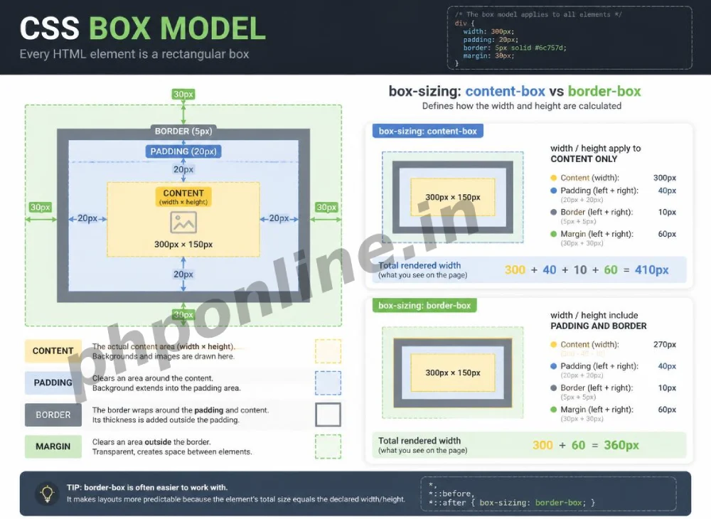
In web development, the browser treats every single HTML element—from simple paragraph text to complex navigation containers, buttons, and image cards—as a rectangular box. If you do not understand how padding, borders, and margins interact with an element’s defined width, layout elements will unexpectedly expand, break line wraps, and push adjacent elements off-screen.
In this comprehensive CSS box model guide, we will explore the 4 concentric layers, total dimensional calculations, the `box-sizing` property (`content-box` vs. `border-box`), margin collapsing behavior, global CSS resets, and hands-on code examples.
Prerequisites Before Learning Box Dimensions
To test the hands-on code examples in this CSS box model tutorial, verify that your development environment meets these basic requirements:
- Web Browser: A modern web browser such as Google Chrome, Mozilla Firefox, Microsoft Edge, or Apple Safari.
- Code Editor: A text editor such as Visual Studio Code, Sublime Text, or Notepad++.
- CSS Foundations: Understanding of CSS rule sets, class selectors, color hex values, and typography.
If you need to review how CSS selectors target specific HTML containers, visit our previous guide on Easy CSS Syntax and Selectors Guide: 5 Core Selector Types & Examples.
1. The 4 Concentric Layers of the CSS Box Model
Every HTML element rendered on a web page is constructed from four concentric rectangular layers, expanding outward from the center:
| Box Model Layer | Layer Position | Visual Characteristic | Primary Layout Purpose |
|---|---|---|---|
| 1. Content Area | Innermost Core | Displays text, images, or child HTML elements. | Holds the primary content payload defined by `width` and `height`. |
| 2. Padding | Surrounds Content Area | Transparent internal space; inherits `background-color`. | Creates breathing room between text content and the element border. |
| 3. Border | Surrounds Padding Area | Visible edge line (styled via color, width, style). | Defines the visual outer boundary of the element box. |
| 4. Margin | Outermost Layer | Completely transparent external space. | Pushes adjacent HTML elements away to create layout gaps. |
Detailed Layer Breakdown:
1. Content Area
The content area is where your actual HTML content lives (such as paragraph text, an image file, or nested child containers). Its dimensions are set using the width and height properties.
2. Padding Area
Padding is the internal spacing between the content area and the outer border line. Padding is completely transparent, meaning it shows whatever background-color or background-image is assigned to the element.
3. Border Area
The border surrounds the padding area. You can customize the border’s thickness (border-width), visual style (border-style: solid;), and color (border-color).
4. Margin Area
Margin is the external spacing outside the border. Margins are transparent and do not show background colors. They are used exclusively to separate the element from neighboring elements on the page.
2. How Browsers Calculate Total Element Dimensions
By default, web browsers use a calculation model called box-sizing: content-box;. Under this default behavior, when you set an element’s width to 300px, that width applies **only to the innermost content area**. Any padding or borders you add are added *on top* of that width.
Default Math Formula (content-box):
/* Default Content-Box Width Formula */
Total Rendered Width = width + left padding + right padding + left border + right border
An Example Calculation Problem:
.card {
    box-sizing: content-box; /* Default Browser Behavior */
    width: 300px;
    padding: 20px;            /* 20px Left + 20px Right = 40px */
    border: 5px solid #000;  /* 5px Left + 5px Right = 10px */
    margin: 15px;
}
What is the actual physical width rendered on screen?
The rendered width is 350px (300px content + 40px total padding + 10px total border), NOT 300px! The 15px margin then adds external space around that 350px box.
This default math often causes layout headaches. If you place two 50% wide elements side-by-side and add padding to them, their combined total width exceeds 100%, causing the second box to break line and drop down below the first!
3. The Solution: box-sizing: border-box
To fix this dimensional math problem, modern CSS provides the box-sizing property. Setting box-sizing: border-box; changes the calculation formula entirely.
When you set box-sizing: border-box;, the browser forces the total rendered width to match your declared width value exactly. Any padding or borders added are absorbed **inward**, shrinking the inner content area rather than expanding the outer box size!
Border-Box Math Comparison:
.card-modern {
    box-sizing: border-box; /* Modern Recommended Behavior */
    width: 300px;
    padding: 20px;
    border: 5px solid #000;
}
Rendered Width with border-box: Exactly 300px on screen! The inner content area automatically shrinks down to 250px so that padding and borders fit perfectly inside the 300px constraint.
| box-sizing Value | Width Property Scope | Effect of Adding Padding & Borders | Predictability Rank |
|---|---|---|---|
content-box (Default) | Applies strictly to Content Area only. | Expands outer element dimensions beyond specified width. | Difficult (Requires manual subtraction math). |
border-box (Recommended) | Applies to Content + Padding + Border combined. | Absorbs spacing inward; total outer width remains fixed. | Excellent (Predictable responsive layouts). |
4. The Universal CSS Box Model Reset
Because border-box makes web layout calculations so much easier, professional front-end developers include a universal CSS reset rule at the absolute top of every stylesheet:
/* Universal CSS Box Model Reset */
*, *::before, *::after {
    box-sizing: border-box;
    margin: 0;
    padding: 0;
}
This universal rule applies box-sizing: border-box; to every HTML element, pseudo-element, and third-party component automatically, while zeroing out default browser margins and padding.
Want to test this CSS code live or build custom styles automatically? Try running it in our Online CSS Editor or generate instant layout rules with our AI CSS Generator.
5. Complete Hands-on Box Model Demonstration Example
Below is a complete HTML document paired with a CSS stylesheet demonstrating the visual layers of the box model, comparing `content-box` against `border-box` side-by-side:
<!DOCTYPE html>
<html lang="en">
<head>
    <meta charset="UTF-8">
    <meta name="viewport" content="width=device-width, initial-scale=1.0">
    <title>CSS Box Model Comparison Demo</title>

    <style>
        body {
            font-family: Arial, sans-serif;
            background-color: #f8f9fa;
            color: #333;
            padding: 20px;
        }

        /* Container for side-by-side comparison */
        .box-container {
            display: flex;
            gap: 20px;
            margin-top: 20px;
        }

        /* 1. Default Content-Box Card */
        .card-content-box {
            box-sizing: content-box;
            width: 300px;
            padding: 25px;
            border: 5px solid #0073aa;
            background-color: #e1f5fe;
            margin-bottom: 20px;
        }

        /* 2. Modern Border-Box Card */
        .card-border-box {
            box-sizing: border-box;
            width: 300px;
            padding: 25px;
            border: 5px solid #0073aa;
            background-color: #e8f5e9;
            margin-bottom: 20px;
        }

        .highlight-text {
            font-weight: bold;
            color: #d32f2f;
        }
    </style>
</head>
<body>

    <h1>Understanding the CSS Box Model</h1>
    <p>Compare how padding and borders affect element dimensions under different box-sizing rules:</p>

    <div class="box-container">

        <div class="card-content-box">
            <h2>content-box</h2>
            <p>Declared Width: 300px</p>
            <p>Padding: 25px | Border: 5px</p>
            <p class="highlight-text">Actual Rendered Width = 360px!</p>
            <p>The box expands outward beyond 300px.</p>
        </div>

        <div class="card-border-box">
            <h2>border-box</h2>
            <p>Declared Width: 300px</p>
            <p>Padding: 25px | Border: 5px</p>
            <p class="highlight-text">Actual Rendered Width = 300px!</p>
            <p>Spacing is absorbed inward cleanly.</p>
        </div>

    </div>

</body>
</html>
Want to test this CSS code live or build custom styles automatically? Try running it in our Online CSS Editor or generate instant layout rules with our AI CSS Generator.
Validating HTML and CSS Code Standards
Mismatched padding values, unclosed style blocks, or missing box-sizing rules can cause layout boxes to overflow off screen on mobile devices.
Before publishing your web page layouts, validate your code syntax using our PHPOnline HTML Validator Tool.
Summary Comparison of Box Model Components
| Box Component | Location Relative to Border | Background Inheritance? | Primary Styling Purpose |
|---|---|---|---|
width / height | Inside Padding | Yes | Defines the core dimensions of the content area. |
padding | Inside Border | Yes | Creates internal spacing between text/content and the outer border line. |
border | Middle Boundary | No (Has its own color) | Defines a visible outline frame around the padding and content. |
margin | Outside Border | No (Transparent) | Creates external spacing to push neighboring elements away. |
Troubleshooting Common Box Model Layout Errors
| Observed Box Layout Error | Probable Cause | Recommended Solution |
|---|---|---|
| Element expands wider than its container, causing horizontal scrollbars | Using default content-box math where added padding and borders increase total element width. | Add box-sizing: border-box; to the element or apply the global CSS reset rule. |
| Two adjacent vertical margins collapse into a single margin gap | Native CSS **Margin Collapsing** where vertical margins of adjacent block elements overlap into the larger single margin value. | This is normal browser behavior. Use padding or flexbox gaps if explicit additive spacing is required. |
| Background color leaks into unwanted layout spacing | Confusing padding with margin (padding shows background color, margin is always transparent). | Replace padding with margin if you want transparent spacing outside the colored box. |
| Inline elements (`<span>`, `<a>`) ignore `width` and top/bottom `margin` settings | Inline elements do not respect block-level box model dimensions by default. | Change the element’s display property to display: inline-block; or display: block;. |
Frequently Asked Questions (FAQ)
Q1: What is the CSS Box Model and why is it fundamental?
The CSS Box Model is a core concept that dictates every HTML element on a webpage as a rectangular box comprising four concentric layers: Content, Padding, Border, and Margin. Understanding the box model is necessary to calculate element dimensions and control layout spacing accurately.
Q2: What is the difference between padding and margin in CSS?
Padding is the internal spacing placed *inside* an element’s border, separating text/content from the border line (padding inherits the element’s background color). Margin is the external spacing placed *outside* an element’s border, pushing neighboring elements away (margins are always transparent).
Q3: What is the difference between content-box and border-box in CSS?
Under content-box (the browser default), declared width applies strictly to the content area, meaning added padding and borders expand the element’s outer dimensions. Under border-box, declared width encompasses content, padding, and border combined, keeping outer dimensions fixed and predictable.
Q4: Why should every CSS stylesheet include a universal box-sizing reset?
Including *, *::before, *::after { box-sizing: border-box; } forces all HTML elements to calculate dimensions predictably. This prevents layouts from breaking when padding or borders are added to responsive columns and flex boxes.
Next Steps & Official References
Consult official technical web standards on the MDN Official CSS Box Model Guide (mozilla.org).
Before publishing your web layouts, validate your code syntax using our PHPOnline HTML Validator Tool.
Ready for the next lesson in sequence? Proceed directly to the next lesson in Module 2: Next Lesson: CSS Margins, Padding & Margin Collapsing Rules →
# Summary
Here is what you've learned in this lesson:
- Easy CSS Box Model Guide: 4 Core Box Layers & Examples
- Overview: Understanding the CSS Box Model & Element Layouts
- Prerequisites Before Learning Box Dimensions
- 1. The 4 Concentric Layers of the CSS Box Model
- 2. How Browsers Calculate Total Element Dimensions
- 3. The Solution: box-sizing: border-box
- 4. The Universal CSS Box Model Reset
- 5. Complete Hands-on Box Model Demonstration Example
- Validating HTML and CSS Code Standards
- Summary Comparison of Box Model Components
- Troubleshooting Common Box Model Layout Errors
- Frequently Asked Questions (FAQ)
- Next Steps & Official References
Continue to the next lesson and learn more about CSS Margins and Padding.