
CSS Borders and Outlines
Easy CSS Borders and Outlines Guide: 5 Core Differences & Examples
Master element framing with this complete CSS borders and outlines guide. Learn border styles, border-radius rounded corners, focus outlines, and box offset rules.
Estimated Read Time: 20 Minutes | Category: Web Development Fundamentals
Overview: Understanding CSS Borders and Outlines & Element Frames
Quick CSS Borders and Outlines Summary:
- Visual Framing Tools: Borders and outlines draw decorative or functional boundary lines around HTML elements to define cards, inputs, and layout containers.
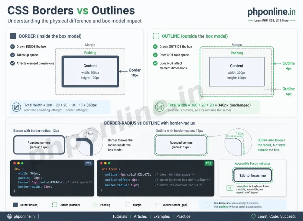
- Box Model Impact: **Borders** occupy physical space inside the box model, affecting total width and height calculations, whereas **Outlines** sit outside the box model without altering element dimensions.
- Border Shorthand: Borders combine width, style, and color into a single line:
border: 2px solid #0073aa;. - Rounded Corners (border-radius): The
border-radiusproperty rounds sharp element corners, creating modern circular avatars or pill-shaped buttons. - Keyboard Focus Accessibility: Outlines are essential for web accessibility, providing clear focus rings around interactive links and input fields for keyboard users.
Welcome to Lesson 7 of our structured Web Development curriculum, marking the final lesson in Module 2: Box Model & Spacing. Following our previous lesson on Easy CSS Margins and Padding Guide: 4 Shorthand Rules & Examples, you now understand how internal padding and external margins structure layout whitespace. The next vital step in styling web components is framing elements using CSS borders and outlines.
While borders and outlines look similar on screen, they serve completely different technical roles in web architecture. Borders are structural box model components used to draw card boundaries, table grid lines, and button shapes. Outlines are non-intrusive overlays used primarily to highlight interactive form fields and active keyboard navigation states for web accessibility compliance.
In this comprehensive CSS borders and outlines guide, we will explore border shorthand syntax, border styles, individual side borders, `border-radius` rounded geometry, focus outlines, `outline-offset` spacing, and hands-on code examples.
Prerequisites Before Framing Elements
To test the hands-on code examples in this CSS borders and outlines guide, verify that your development environment meets these basic requirements:
- Web Browser: A modern web browser such as Google Chrome, Mozilla Firefox, Microsoft Edge, or Apple Safari.
- Code Editor: A text editor such as Visual Studio Code, Sublime Text, or Notepad++.
- Box Model Foundations: Understanding of `box-sizing: border-box;`, padding, and margin spacing.
If you need to review how box-sizing calculations encompass border thickness, visit our previous guide on Easy CSS Box Model Guide: 4 Core Box Layers & Examples.
1. Working with CSS Borders
A border is a visible line drawn around an element’s padding and content area. Borders consist of three core properties:
border-width: Sets the line thickness (e.g.,1px,3px,thin,thick).border-style: Sets the line pattern (e.g.,solid,dashed,dotted,double,none). Mandatory property!border-color: Sets the line color (e.g.,#0073aa,rgba(...)).
The Border Shorthand Syntax:
Instead of writing three separate CSS declarations, combine them into a single border shorthand rule specifying **Width → Style → Color**:
/* Border Shorthand Syntax: Width Style Color */
.card-box {
    border: 2px solid #0073aa;
}
Individual Side Borders
You can target individual edges of an element to create modern UI effects, such as a left accent border on callout boxes:
/* Left Accent Border Example */
.callout-box {
    background-color: #f0f7ff;
    padding: 15px;
    border-left: 4px solid #0073aa; /* Applies border to left side only */
}
Want to test this CSS code live or build custom styles automatically? Try running it in our Online CSS Editor or generate instant layout rules with our AI CSS Generator.
2. Rounded Corners with border-radius
The border-radius property rounds the sharp 90-degree corners of element boxes, creating smooth cards, pill-shaped buttons, or perfect circular image avatars.
A. Subtle Rounded Corners
/* Rounds all 4 corners by 8 pixels */
.card-smooth {
    border: 1px solid #e0e0e0;
    border-radius: 8px;
}
B. Pill-Shaped Buttons
/* High pixel radius creates pill-shaped buttons */
.btn-pill {
    padding: 10px 24px;
    border-radius: 50px;
}
C. Perfect Circles (Avatars & Badges)
To turn a square element into a perfect circle, set border-radius: 50%; on an element with identical width and height dimensions:
/* Circular Avatar Image */
.user-avatar {
    width: 100px;
    height: 100px;
    border-radius: 50%;
    object-fit: cover;
}
Want to test this CSS code live or build custom styles automatically? Try running it in our Online CSS Editor or generate instant layout rules with our AI CSS Generator.
3. Working with CSS Outlines
An **outline** is a line drawn around elements, outside the border edge. While outlines resemble borders visually, they behave completely differently in the browser.
The Outline Shorthand Syntax:
/* Outline Shorthand Syntax: Width Style Color */
.focused-input {
    outline: 3px solid #ff9800;
}
The outline-offset Property
Unlike borders, outlines support the outline-offset property, which creates a transparent gap between the element’s outer edge and the outline ring:
/* Creates a 4px gap between border and outline */
.accent-card {
    border: 2px solid #0073aa;
    outline: 2px dashed #0073aa;
    outline-offset: 4px; /* Space between border and outline */
}
4. Key Differences: Borders vs. Outlines
| Feature / Property | CSS Border | CSS Outline |
|---|---|---|
| Box Model Integration | Part of the element box model; consumes physical layout space. | Not part of the box model; drawn on top of adjacent elements. |
| Layout Reflow Impact | Changing border width pushes neighboring elements away. | Changing outline width never affects neighboring elements or layout positions. |
| Individual Side Control? | Yes (e.g., border-top, border-left). | No (Outlines enclose all 4 sides simultaneously). |
| Supports Rounded Corners? | Yes (Follows border-radius perfectly). | Varies across browsers (Outlines are typically rectangular). |
| Offset Spacing Support? | No | Yes (Supports outline-offset). |
| Primary Application Scenario | Card borders, tables, button frames, visual separators. | Focus rings for accessibility (interactive inputs and links). |
5. Accessibility & Focus Outlines (:focus-visible)
Keyboard users who navigate websites using the Tab key rely on visual focus indicators to see which link or form field is active.
Accessibility Warning: Never write outline: none; or outline: 0; without replacing it with an explicit custom focus style! Removing focus outlines makes a website completely unnavigable for motor-impaired visitors.
Modern Best Practice using :focus-visible
The :focus-visible pseudo-class displays focus rings when a user navigates via keyboard, while suppressing them during mouse clicks:
/* Accessible Custom Focus Indicator */
button:focus-visible,
input:focus-visible {
    outline: 3px solid #ff9800;
    outline-offset: 2px;
}
Want to test this CSS code live or build custom styles automatically? Try running it in our Online CSS Editor or generate instant layout rules with our AI CSS Generator.
6. Complete Hands-on Demonstration Example
Below is a complete HTML document paired with a CSS stylesheet demonstrating card borders, rounded avatars, dashed offset outlines, and accessible focus styles combined:
<!DOCTYPE html>
<html lang="en">
<head>
<meta charset="UTF-8">
<meta name="viewport" content="width=device-width, initial-scale=1.0">
<title>CSS Borders and Outlines Demonstration</title>
<style>
*, *::before, *::after {
box-sizing: border-box;
margin: 0;
padding: 0;
}
body {
font-family: Arial, sans-serif;
background-color: #f4f6f9;
color: #333;
padding: 30px;
max-width: 800px;
margin: 0 auto;
}
/* Card with Smooth Border and Rounded Geometry */
.user-card {
background-color: #ffffff;
border: 1px solid #e0e0e0;
border-left: 5px solid #0073aa; /* Accent border */
border-radius: 8px;
padding: 20px;
margin-bottom: 25px;
display: flex;
align-items: center;
gap: 20px;
}
/* Circular Avatar Image */
.avatar {
width: 70px;
height: 70px;
border-radius: 50%; /* Perfect Circle */
border: 2px solid #0073aa;
}
/* Form Controls with Offset Outline Effects */
.form-group {
margin-bottom: 20px;
}
.form-group label {
display: block;
margin-bottom: 6px;
font-weight: bold;
}
.input-field {
width: 100%;
padding: 10px 14px;
border: 1px solid #ccc;
border-radius: 4px;
font-size: 16px;
}
/* Accessible Focus State using :focus-visible */
.input-field:focus-visible {
border-color: #0073aa;
outline: 3px solid #ff9800;
outline-offset: 2px;
}
</style>
</head>
<body>
<h1>CSS Borders & Outlines in Action</h1>
<!-- User Card Component -->
<div class="user-card">
<div class="avatar" style="background-color: #0073aa;"></div>
<div>
<h3>Alex Mercer</h3>
<p>Full-Stack Web Engineer | PHPOnline Student</p>
</div>
</div>
<!-- Accessible Form Input -->
<div class="form-group">
<label for="email">Test Focus Indicator (Press Tab key):</label>
<input type="email" id="email" class="input-field" placeholder="alex@phponline.in">
</div>
</body>
</html>Want to test this CSS code live or build custom styles automatically? Try running it in our Online CSS Editor or generate instant layout rules with our AI CSS Generator.
Validating HTML and CSS Code Standards
Missing border-style declarations or invalid hex colors can cause borders to vanish unexpectedly.
Before publishing your web page layouts, validate your code syntax using our PHPOnline HTML Validator Tool.
Summary Comparison of Framing Properties
| CSS Property | Sample Syntax | Affects Layout Dimensions? | Primary Styling Scenario |
|---|---|---|---|
border | 1px solid #0073aa | Yes (Consumes box space) | Card boundaries, tables, buttons, and structural container lines. |
border-radius | 8px / 50% | No | Rounds sharp 90-degree corners to create circular images or pill buttons. |
outline | 3px solid #ff9800 | No (Overlays outside box) | Keyboard focus accessibility indicators and form field highlights. |
outline-offset | 2px / 4px | No | Creates a transparent gap between the element border and the outline ring. |
Troubleshooting Common Border and Outline Errors
| Observed Styling Issue | Probable Cause | Recommended Solution |
|---|---|---|
| Border property fails to render on screen completely | Forgetting to declare the border-style property (e.g., writing border-width: 2px; border-color: red; without border-style: solid;). | Always declare border-style or use the 3-value shorthand border: 2px solid red;. |
| Hovering over an element with a new border causes layout jumping | Adding a border on hover increases the box model width, pushing neighboring elements. | Use a transparent border initially (border: 2px solid transparent;) or use outline on hover instead. |
border-radius: 50%; produces an oval instead of a perfect circle | Applying a 50% border-radius to a rectangular element whose width and height are unequal. | Ensure the element’s width and height are set to identical pixel dimensions. |
| Accessibility screen reader warnings regarding missing focus rings | Writing outline: none; without supplying an alternative focus indicator. | Replace default outlines using :focus-visible with custom high-contrast focus rings. Validate code with our HTML Validator Tool. |
Frequently Asked Questions (FAQ)
Q1: What are CSS borders and outlines and why are they important?
CSS borders and outlines are framing properties used to enclose HTML elements. Borders define structural boundaries for cards and buttons, while outlines create non-intrusive focus rings that guide keyboard navigation for web accessibility.
Q2: What is the main difference between a border and an outline in CSS?
A **border** is part of the element’s box model and consumes physical space, affecting width calculations. An **outline** sits outside the box model, drawn on top of adjacent content without altering element dimensions or layout positioning.
Q3: How do you create a circular image avatar using CSS border-radius?
To create a circular avatar, assign identical width and height dimensions to an image box and set border-radius: 50%;.
Q4: Why is outline: none considered bad practice for web accessibility?
Removing outlines via outline: none; strips away focus rings, making it impossible for keyboard users to see which link or form field is active. Always supply a custom :focus-visible style if you remove default browser outlines.
Course Progress & Official References
Congratulations on completing Module 2: Box Model & Spacing! You now possess expert skills spanning element box dimensions, content-box vs. border-box, padding, margin auto centering, vertical margin collapsing, and border geometry.
Consult official technical web standards on the MDN Official CSS Border Reference (mozilla.org).
Before publishing your web page layouts, validate your code syntax using our PHPOnline HTML Validator Tool.
Ready to move to Module 3? Proceed directly to the first lesson in Module 3: Next Lesson: CSS Display Property (Block, Inline, Inline-Block, None) →
# Summary
Here is what you've learned in this lesson:
- Easy CSS Borders and Outlines Guide: 5 Core Differences & Examples
- Overview: Understanding CSS Borders and Outlines & Element Frames
- Prerequisites Before Framing Elements
- 1. Working with CSS Borders
- 2. Rounded Corners with border-radius
- 3. Working with CSS Outlines
- 4. Key Differences: Borders vs. Outlines
- 5. Accessibility & Focus Outlines (:focus-visible)
- 6. Complete Hands-on Demonstration Example
- Validating HTML and CSS Code Standards
- Summary Comparison of Framing Properties
- Troubleshooting Common Border and Outline Errors
- Frequently Asked Questions (FAQ)
- Course Progress & Official References
Continue to the next lesson and learn more about CSS Display Property.