
CSS Transitions and Animations
Easy CSS Transitions and Animations Guide: 6 Core Keyframe Rules & Examples
Master web motion design with this complete CSS transitions and animations guide. Learn transition duration, timing functions, @keyframes, transform 2D/3D, and performance rules.
Estimated Read Time: 23 Minutes | Category: Web Development Fundamentals
Overview: Understanding CSS Transitions and Animations & Motion Design
Quick CSS Transitions and Animations Summary:
- Interactive Visual Feedback: CSS transitions and animations bring web interfaces to life, providing smooth visual feedback when users hover over buttons, toggle modal windows, or scroll through content.
- State-to-State Smoothness (Transitions): The
transitionproperty interpolates property changes smoothly over a specified duration when an element switches between two states (e.g., normal state to:hoverstate). - Multi-Step Keyframe Sequences (@keyframes): The
@keyframesdirective defines complex, multi-stage animations that execute automatically without requiring JavaScript or state triggers. - 2D and 3D Transformations (transform): The
transformproperty alters element geometry (moving, scaling, rotating, or skewing) without triggering costly browser layout recalculations. - Hardware-Accelerated Performance: Animating GPU-accelerated properties (like
transformandopacity) guarantees buttery-smooth 60fps (frames per second) performance on mobile screens.
Welcome to Lesson 13 of our structured Web Development curriculum, marking the final master lesson in Module 4: Responsive Design & Modern Features. Following our previous lesson on Easy CSS Media Queries Guide: 5 Responsive Breakpoint Rules & Examples, you now understand how to adapt web layouts across mobile, tablet, and desktop viewports. The final step in mastering modern front-end engineering is creating engaging, high-performance UI motion using CSS transitions and animations.
In the early web, animating elements on a screen required heavy JavaScript libraries or Adobe Flash plugins that consumed excessive CPU memory and drained mobile battery life. Modern CSS handles UI motion natively inside the browser rendering engine. Whether you are building subtle hover feedback for call-to-action buttons, sliding mobile drawer menus, or pulsing notification badges, native CSS transitions and keyframe animations deliver hardware-accelerated, 60fps performance.
In this comprehensive CSS transitions and animations guide, we will explore transition properties, timing functions, 2D/3D transformations (`transform`), `@keyframes` syntax, animation fill modes, infinite looping, GPU acceleration performance rules, and hands-on code examples.
Prerequisites Before Animating Web Components
To test the hands-on code examples in this CSS transitions and animations tutorial, verify that your development environment meets these basic requirements:
- Web Browser: A modern web browser such as Google Chrome, Mozilla Firefox, Microsoft Edge, or Apple Safari.
- Code Editor: A text editor such as Visual Studio Code, Sublime Text, or Notepad++.
- CSS Layout Foundations: Solid understanding of pseudo-classes (
:hover,:focus), colors, and the CSS Box Model.
If you need to review how state pseudo-classes target interactive user actions, visit our previous guide on Easy CSS Syntax and Selectors Guide: 5 Core Selector Types & Examples.
1. Smooth State Changes with CSS Transitions
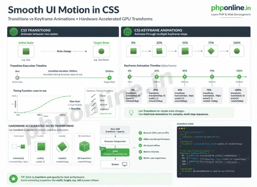
A **CSS transition** controls the speed at which a CSS property changes from an initial starting value to a target end value when triggered by a state change (such as hovering over a button or focusing an input field).
The 4 Core Transition Sub-Properties:
transition-property: Specifies which CSS property (or properties) to animate (e.g.,background-color,transform,opacity, orall).transition-duration: Specifies how long the transition animation takes to complete, measured in seconds (s) or milliseconds (ms) (e.g.,0.3sor300ms).transition-timing-function: Dictates the acceleration curve speed of the transition (e.g.,ease,linear,ease-in,ease-out,ease-in-out).transition-delay: Specifies a waiting delay before the transition animation begins executing.
The Transition Shorthand Syntax:
Combine all four sub-properties into a single transition shorthand rule specifying **Property → Duration → Timing Function → Delay**:
/* Transition Shorthand Syntax: property duration timing-function delay */
.btn-smooth {
    background-color: #0073aa;
    color: #ffffff;
    /* Smoothly animates background-color changes over 0.3 seconds */
    transition: background-color 0.3s ease-in-out;
}

.btn-smooth:hover {
    background-color: #005177;
}
Want to test this CSS code live or build custom styles automatically? Try running it in our Online CSS Editor or generate instant layout rules with our AI CSS Generator.
2. Geometry Manipulation with the CSS transform Property
The transform property alters an element’s visual coordinate space without disrupting neighboring document flow or causing layout reflows. Combining transform with transition produces smooth 60fps UI effects.
Core 2D Transform Functions:
translate(x, y): Moves an element horizontally along the X-axis and vertically along the Y-axis (e.g.,transform: translateY(-5px);moves an element 5px upward).scale(x, y): Enlarges or shrinks an element relative to its original size (e.g.,transform: scale(1.05);scales an element to 105% size).rotate(angle): Rotates an element clockwise or counter-clockwise around its origin point (e.g.,transform: rotate(45deg);).skew(x-angle, y-angle): Distorts an element along its 2D axes.
Interactive Hover Card Example:
/* Modern Floating Card Hover Effect */
.card-hover {
    background-color: #ffffff;
    border: 1px solid #e0e0e0;
    padding: 20px;
    border-radius: 8px;
    /* Transition transform and box-shadow smoothly */
    transition: transform 0.3s ease, box-shadow 0.3s ease;
}

.card-hover:hover {
    /* Lift card 6px upward and enlarge slightly on hover */
    transform: translateY(-6px) scale(1.02);
    box-shadow: 0 12px 24px rgba(0, 0, 0, 0.15);
}
Want to test this CSS code live or build custom styles automatically? Try running it in our Online CSS Editor or generate instant layout rules with our AI CSS Generator.
3. Multi-Step Animations with @keyframes
While transitions require an external user trigger (like a mouse hover) to switch between two states, **CSS Keyframe Animations** execute complex, multi-stage animation sequences automatically.
Two Steps to Create a CSS Animation:
- Define the animation stages using the
@keyframesrule set, specifying percentage checkpoints (e.g.,0%,50%,100%orfrom/to). - Bind the keyframe animation name to target HTML elements using the
animationproperty.
Anatomy of @keyframes Syntax:
/* 1. Defining the Keyframe Animation Sequence */
@keyframes pulseGlow {
    0% {
        transform: scale(1);
        opacity: 1;
    }
    50% {
        transform: scale(1.1);
        opacity: 0.7;
    }
    100% {
        transform: scale(1);
        opacity: 1;
    }
}

/* 2. Binding Animation to a Notification Badge */
.badge-pulsing {
    background-color: #d32f2f;
    color: #ffffff;
    padding: 6px 12px;
    border-radius: 20px;
    /* Animation Shorthand: name duration timing-function iteration-count */
    animation: pulseGlow 2s ease-in-out infinite;
}
Want to test this CSS code live or build custom styles automatically? Try running it in our Online CSS Editor or generate instant layout rules with our AI CSS Generator.
4. Understanding animation-fill-mode and Loop Controls
By default, when a CSS animation finishes playing, the element jumps back to its original un-animated starting styles. The animation-fill-mode property controls what styles apply to the element before and after execution:
| animation-fill-mode Value | Post-Animation Behavior | Primary Application Scenario |
|---|---|---|
none (Default) | Element retains no animation styles when the animation finishes; jumps back to base CSS. | Repeating cyclical animations or quick notification flashes. |
forwards | Element retains final keyframe styles (100%) permanently after the animation completes. | Fade-in entry banners, sliding drawers, progress bars that stay full. |
backwards | Element applies initial keyframe styles (0%) during any pre-animation delay period. | Staggered entry sequences with delayed starting times. |
both | Applies both backwards and forwards rules simultaneously. | Best Practice: Smooth, professional entrance animations. |
5. Hardware Acceleration & Performance Rules
Not all CSS properties are equal when it comes to rendering performance. Animating certain properties causes browser performance lag (jank) on mobile screens.
The 3 Browser Rendering Pipeline Stages:
- Layout Stage: Recalculates element positions and geometry (Heavy CPU cost!).
- Paint Stage: Fills pixels for colors, shadows, and text (Moderate CPU cost).
- Composite Stage: Layer positioning handled directly by the GPU graphics chip (Ultra-Fast 60fps!).
Performance Golden Rule:
Only animate transform and opacity! Properties like width, height, margin, and top/left trigger the Layout stage, forcing the browser to re-calculate page geometry every frame. Animating transform (translate, scale, rotate) and opacity triggers GPU Compositing only, ensuring silky-smooth 60fps performance across mobile devices.
/* ❌ POOR PERFORMANCE: Triggers Layout Recalculations */
.box-laggy:hover {
    width: 300px;
    margin-top: -10px;
}

/* ✅ HIGH PERFORMANCE: Hardware-Accelerated GPU Compositing */
.box-smooth:hover {
    transform: translateY(-10px) scale(1.05);
}
6. Complete Hands-on Interactive Motion Example
Below is a complete HTML document paired with a CSS stylesheet demonstrating smooth button transitions, interactive card floating, an animated loading spinner, and an automatic fade-in header combined:
<!DOCTYPE html>
<html lang="en">
<head>
<meta charset="UTF-8">
<meta name="viewport" content="width=device-width, initial-scale=1.0">
<title>CSS Transitions and Animations Demonstration</title>
<style>
*, *::before, *::after {
box-sizing: border-box;
margin: 0;
padding: 0;
}
body {
font-family: Arial, sans-serif;
background-color: #f4f6f9;
color: #333;
padding: 30px;
max-width: 800px;
margin: 0 auto;
}
/* 1. Keyframes: Entrance Fade-In Slide Down */
@keyframes fadeInDown {
from {
opacity: 0;
transform: translateY(-20px);
}
to {
opacity: 1;
transform: translateY(0);
}
}
/* 2. Keyframes: Continuous Loading Spinner Rotation */
@keyframes spin {
0% { transform: rotate(0deg); }
100% { transform: rotate(360deg); }
}
/* Hero Header with Entrance Animation */
.hero-header {
background-color: #0073aa;
color: #ffffff;
padding: 30px;
border-radius: 8px;
text-align: center;
margin-bottom: 25px;
/* Applies entrance animation once, retaining final state */
animation: fadeInDown 0.8s ease-out forwards;
}
/* Interactive Floating Card with CSS Transition */
.card-interactive {
background-color: #ffffff;
border: 1px solid #e0e0e0;
border-radius: 8px;
padding: 25px;
margin-bottom: 25px;
/* GPU-accelerated transition */
transition: transform 0.3s ease, box-shadow 0.3s ease;
}
.card-interactive:hover {
transform: translateY(-5px);
box-shadow: 0 10px 20px rgba(0, 0, 0, 0.12);
}
/* Button with Transition Effect */
.btn-action {
display: inline-block;
background-color: #0073aa;
color: #ffffff;
text-decoration: none;
padding: 12px 24px;
border-radius: 4px;
font-weight: bold;
transition: background-color 0.2s ease, transform 0.2s ease;
}
.btn-action:hover {
background-color: #005177;
transform: scale(1.03);
}
/* Loading Spinner Component */
.spinner-container {
display: flex;
align-items: center;
gap: 12px;
margin-top: 15px;
}
.spinner {
width: 24px;
height: 24px;
border: 3px solid #e0e0e0;
border-top: 3px solid #0073aa;
border-radius: 50%;
/* Continuous infinite rotation animation */
animation: spin 1s linear infinite;
}
</style>
</head>
<body>
<!-- Entrance Animated Header -->
<div class="hero-header">
<h1>PHPOnline Motion Masterclass</h1>
<p>Smooth, hardware-accelerated CSS transitions & animations.</p>
</div>
<!-- Interactive Card Component -->
<div class="card-interactive">
<h2 style="color: #0073aa; margin-bottom: 10px;">Interactive UI Motion</h2>
<p style="line-height: 1.6; margin-bottom: 20px;">
Hover over this card or the button below to observe hardware-accelerated 60fps transform transitions in action!
</p>
<a href="#" class="btn-action">Hover Action Button</a>
<!-- Continuous Spinner -->
<div class="spinner-container">
<div class="spinner"></div>
<span style="font-size: 14px; color: #666;">Keyframe spinner executing @keyframes spin...</span>
</div>
</div>
</body>
</html>Want to test this CSS code live or build custom styles automatically? Try running it in our Online CSS Editor or generate instant layout rules with our AI CSS Generator.
Validating HTML and CSS Code Standards
Syntax typos inside `@keyframes` percentages or missing transition measurement units (e.g., writing transition: 0.3 without s) will cause browser parsers to reject motion declarations silently.
Before publishing your web page layouts, validate your code syntax using our PHPOnline HTML Validator Tool.
Summary Comparison of Motion Properties
| Feature / Property | CSS Transitions | CSS Animations (@keyframes) |
|---|---|---|
| State Change Mechanism | Requires a state trigger (e.g., :hover, :focus, active class). | Executes automatically upon page load or trigger. |
| Number of States | Interpolates between exactly two states (Start → End). | Supports unlimited multi-step keyframe states (0% → 50% → 100%). |
| Looping Control | Runs once per trigger event. | Supports infinite looping (animation-iteration-count: infinite;). |
| GPU Acceleration | High performance when animating transform / opacity. | High performance when animating transform / opacity. |
| Primary Application Scenario | Hover button feedback, menu transitions, input focus rings. | Loading spinners, pulsing notification badges, entrance banners. |
Troubleshooting Common CSS Motion Errors
| Observed Motion Issue | Probable Cause | Recommended Solution |
|---|---|---|
| Transition animation jumps instantly without smoothing | Forgetting the time unit suffix in duration (e.g., writing transition: background 0.3 without s or ms). | Always declare explicit time units (e.g., 0.3s or 300ms). |
| Keyframe animation jumps back to original state abruptly when finished | Omitting animation-fill-mode: forwards; on non-looping entrance animations. | Add animation-fill-mode: forwards; to retain final 100% keyframe styles permanently. |
| Animations feel laggy, stuttery, or drop frames on mobile devices | Animating layout-triggering properties (like width, height, top, left, or margin). | Replace dimensional animations with GPU-accelerated transform (scale, translate) and opacity. |
| Hover transition effects do not trigger on mobile touchscreens | Mobile devices do not have persistent mouse hover cursors. | Ensure interactive elements have alternative active focus/touch states or tap triggers. Validate code with our HTML Validator Tool. |
Frequently Asked Questions (FAQ)
Q1: What are CSS transitions and animations and why are they fundamental?
CSS transitions and animations are native properties used to create interactive motion in web interfaces. Transitions smoothly interpolate state changes (like hover effects), while keyframe animations execute complex, multi-stage motion sequences automatically.
Q2: What is the main difference between CSS transitions and @keyframes animations?
Transitions require an interactive state change trigger (like :hover) and interpolate between two states (start to end). Keyframe animations execute automatically without state triggers and support complex multi-stage keyframe steps (0% to 100%) with infinite looping controls.
Q3: Why should you only animate transform and opacity for high performance?
Animating transform and opacity triggers GPU Compositing, bypassing heavy CPU Layout and Paint recalculations. This guarantees silky-smooth 60fps performance without frame drops on mobile devices.
Q4: What does animation-fill-mode: forwards do in CSS?
animation-fill-mode: forwards instructs the browser to apply the final 100% keyframe animation styles permanently to the element after the animation finishes playing, preventing it from jumping back to its original un-animated state.
Course Completion & Official References
Congratulations on completing the entire structured CSS tutorial series curriculum roadmap! You now possess expert front-end engineering skills spanning CSS syntax, selectors, box model calculations, spacing rules, borders, display modes, static/relative/absolute/fixed/sticky positioning, 1D Flexbox, 2D Grid systems, mobile-first media queries, and GPU-accelerated motion design.
Consult official technical web standards on the MDN Official CSS Animations Guide (mozilla.org).
Before publishing your web page layouts, validate your code syntax using our PHPOnline HTML Validator Tool.
Return to Main Course Index or Backend Track: Revisit front-end foundations or advance to backend PHP & database development: Course Homepage: Best PHP & Web Development Tutorials →
# Summary
Here is what you've learned in this lesson:
- Easy CSS Transitions and Animations Guide: 6 Core Keyframe Rules & Examples
- Overview: Understanding CSS Transitions and Animations & Motion Design
- Prerequisites Before Animating Web Components
- 1. Smooth State Changes with CSS Transitions
- 2. Geometry Manipulation with the CSS transform Property
- 3. Multi-Step Animations with @keyframes
- 4. Understanding animation-fill-mode and Loop Controls
- 5. Hardware Acceleration & Performance Rules
- 6. Complete Hands-on Interactive Motion Example
- Validating HTML and CSS Code Standards
- Summary Comparison of Motion Properties
- Troubleshooting Common CSS Motion Errors
- Frequently Asked Questions (FAQ)
- Course Completion & Official References
Continue to the next lesson and learn more about Why is Marquee in HTML and CSS Context Named That Way?.