
CSS Media Queries
Easy CSS Media Queries Guide: 5 Responsive Breakpoint Rules & Examples
Master mobile-first web design with this complete CSS media queries guide. Learn min-width breakpoints, orientation, viewport scaling, and fluid typography.
Estimated Read Time: 22 Minutes | Category: Web Development Fundamentals
Overview: Understanding CSS Media Queries & Responsive Web Design
Quick CSS Media Queries Summary:
- Adaptive Viewport Engine: CSS media queries are the foundation of Responsive Web Design (RWD), enabling stylesheets to inspect device characteristics (screen width, orientation, resolution) and apply custom CSS styles dynamically.
- The @media Rule: Media query conditional blocks wrap standard CSS rule sets inside
@media (feature) { ... }conditional wrappers that execute only when screen parameters match. - Mobile-First Architecture: Designing base styles for small mobile screens first and using
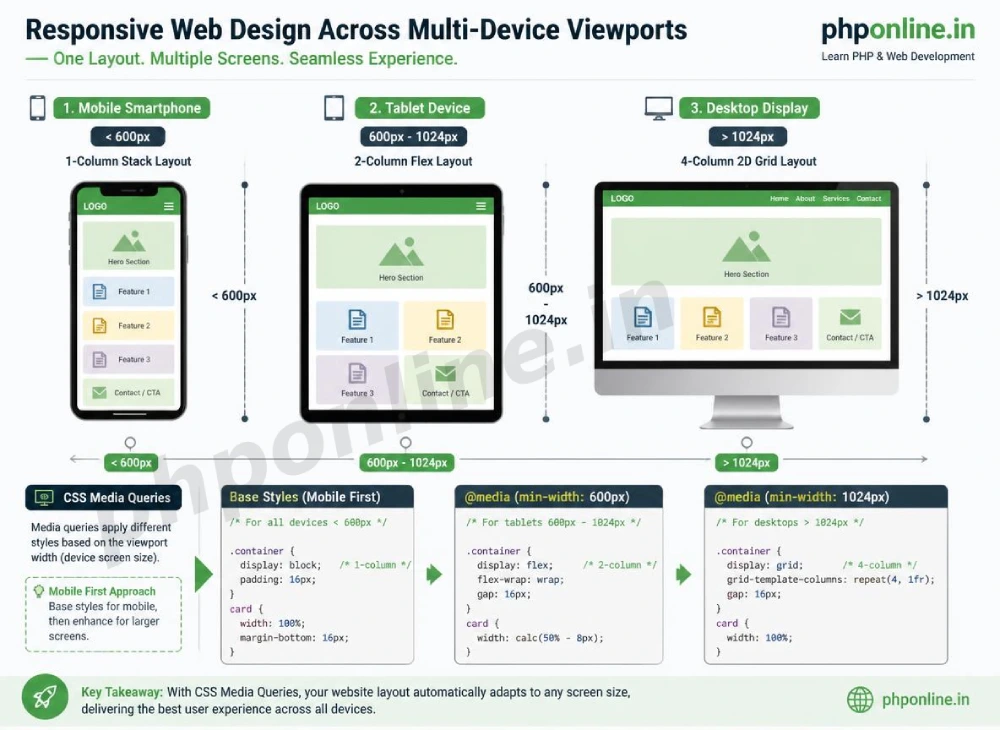
min-widthbreakpoints to enhance desktop layouts ensures optimal performance across mobile networks. - Standard Screen Breakpoints: Popular breakpoint thresholds target Mobile (up to 599px), Tablet (600px to 1023px), Desktop (1024px to 1439px), and Ultra-wide Displays (1440px+).
- Mandatory Viewport Meta Tag: Every responsive webpage must include
<meta name="viewport" content="width=device-width, initial-scale=1.0">inside the HTML<head>to prevent mobile browsers from rendering tiny desktop scales.
Welcome to Lesson 12 of our structured Web Development curriculum, marking the beginning of Module 4: Responsive Design & Modern Features. Following our previous lesson on Easy CSS Grid Layouts Guide: 6 Essential Grid Properties & Examples, you now understand how to build two-dimensional card grids and application shells. The next vital milestone in modern front-end engineering is adapting those layouts across all screen sizes using CSS media queries.
Over 60% of global web traffic originates from mobile smartphones and tablets. In early web design, developers built separate subdomains for mobile devices (such as m.example.com). Modern CSS eliminated duplicate sites by introducing fluid Responsive Web Design. With media queries, a single codebase adjusts font sizes, rearranges navigation menus, stacks multi-column grids into single columns, and optimizes image assets automatically based on the visitor’s screen width.
In this comprehensive CSS media queries guide, we will explore `@media` syntax, mobile-first vs. desktop-first strategies, standard breakpoint thresholds, viewport scaling rules, orientation testing, fluid typography, and hands-on code examples.
Prerequisites Before Building Responsive Stylesheets
To test the hands-on code examples in this CSS media queries tutorial, verify that your development environment meets these basic requirements:
- Web Browser: A modern web browser such as Google Chrome, Mozilla Firefox, Microsoft Edge, or Apple Safari (utilizing Browser Developer Tools Device Mode).
- Code Editor: A text editor such as Visual Studio Code, Sublime Text, or Notepad++.
- Layout Foundations: Solid understanding of CSS Flexbox, CSS Grid, and relative sizing units (`rem`, `%`).
If you need to review how 1D Flexbox and 2D Grid layouts rearrange child components, visit our previous guide on Easy CSS Flexbox Guide: 6 Core Flex Properties & Layout Examples.
1. The Mandatory Mobile Viewport Meta Tag
Before writing a single line of CSS media query code, you must include the HTML5 **Viewport Meta Tag** inside the <head> section of every web page:
<!-- Mandatory Responsive Viewport Directive -->
<meta name="viewport" content="width=device-width, initial-scale=1.0">
Why the Viewport Meta Tag Is Required:
When smart mobile phones first appeared, web browsers attempted to render un-optimized desktop websites by forcing a virtual 980-pixel canvas and shrinking the layout down. Without the viewport meta tag, mobile browsers ignore CSS media queries and render web pages as tiny, unreadable desktop views requiring manual pinch-to-zoom.
Declaring width=device-width instructs the browser to set the webpage canvas width directly to the device’s physical screen pixel width, enabling media query breakpoints to trigger accurately.
2. Anatomy of @media Query Syntax
A CSS media query consists of a media type (such as screen or print) and one or more conditional feature expressions (such as min-width or orientation):
/* Standard Media Query Syntax Architecture */
@media media-type and (media-feature-expression) {
    /* CSS rule sets placed inside this block execute ONLY when conditions are met */
    selector {
        property: value;
    }
}
Breakdown of Media Query Syntax Components:
@media: The CSS rule directive telling the parser that a conditional stylesheet block follows.screen: Specifies the target media type (common types:screenfor digital displays,printfor paper printer previews, orallfor all devices).and: Logical operator combining media types and feature expressions.(min-width: 768px): The conditional feature expression. If the browser viewport is 768 pixels or wider, the enclosed CSS rules execute.
Basic Media Query Code Example
/* Base Mobile Style: Red Heading */
h1 {
    color: #d32f2f;
    font-size: 1.5rem;
}

/* Tablet & Desktop Override: Blue Heading on screens 768px and wider */
@media screen and (min-width: 768px) {
    h1 {
        color: #0073aa;
        font-size: 2.25rem;
    }
}
Want to test this CSS code live or build custom styles automatically? Try running it in our Online CSS Editor or generate instant layout rules with our AI CSS Generator.
3. Mobile-First vs. Desktop-First Breakpoint Strategy
When structuring responsive stylesheets, developers choose between two architectural methodologies:
| Strategy Type | Primary Feature Expression | Base CSS Target | Industry Recommendation |
|---|---|---|---|
| Mobile-First Strategy | (min-width: ...) | Base styles target mobile screens first; media queries progressively add styles as screen width expands. | Best Practice: Faster mobile performance, cleaner code, prioritized core content. |
| Desktop-First Strategy | (max-width: ...) | Base styles target large desktop screens first; media queries override styles as screen width shrinks. | Legacy approach; often results in heavier mobile payload downloads. |
Mobile-First Code Pattern (Min-Width):
/* 1. Base Styles (Applies to ALL screens, optimized for Mobile < 600px) */
.content-sidebar-layout {
    display: flex;
    flex-direction: column; /* Stacks vertically on mobile phones */
    gap: 15px;
}

/* 2. Tablet Breakpoint (600px and wider) */
@media (min-width: 600px) {
    .content-sidebar-layout {
        gap: 25px;
    }
}

/* 3. Desktop Breakpoint (1024px and wider) */
@media (min-width: 1024px) {
    .content-sidebar-layout {
        flex-direction: row; /* Switches to side-by-side columns on desktop screens */
    }
}
Want to test this CSS code live or build custom styles automatically? Try running it in our Online CSS Editor or generate instant layout rules with our AI CSS Generator.
4. Standard Device Breakpoint Thresholds
Rather than designing for specific phone brand models (which change every year), base your media query breakpoints on logical content reflow points:
| Target Device Class | Breakpoint Feature Query | Typical Viewport Width | Common Layout Adjustments |
|---|---|---|---|
| Mobile Phones | Base CSS (No query needed) | < 600px | Single-column vertical stacks, hamburger menus, large touch targets. |
| Tablets & Large Foldables | @media (min-width: 600px) | 600px – 1023px | 2-column flex grids, visible secondary navigation links. |
| Laptops & Desktops | @media (min-width: 1024px) | 1024px – 1439px | 3-column or 4-column 2D grids, sticky sidebars, hover effects. |
| Ultra-Wide Monitors | @media (min-width: 1440px) | 1440px+ | Max-width content containers, expanded multi-column galleries. |
5. Testing Device Orientation and Print Styles
Media queries can inspect media features beyond viewport width, such as screen orientation and print output modes:
A. Screen Orientation Testing (portrait vs. landscape)
/* Adjusts video gallery padding when tablet is rotated into landscape mode */
@media (orientation: landscape) {
    .video-gallery {
        grid-template-columns: repeat(3, 1fr);
    }
}
B. Print Stylesheet Overrides (@media print)
When visitors print a web page or save it as a PDF, print media queries allow you to hide unneeded navigation bars, ads, and background colors to conserve paper and ink:
/* Styles applied strictly when printing the document */
@media print {
    /* Hide non-printable navigation bars and sidebars */
    header, nav, footer, .sidebar, .btn {
        display: none !important;
    }

    body {
        background-color: #ffffff !important;
        color: #000000 !important;
        font-size: 12pt;
    }
}
Want to test this CSS code live or build custom styles automatically? Try running it in our Online CSS Editor or generate instant layout rules with our AI CSS Generator.
6. Complete Hands-on Responsive Web Page Example
Below is a complete HTML document paired with a mobile-first CSS stylesheet demonstrating responsive navigation, multi-column card grid reflowing, and adaptive typography combined:
<!DOCTYPE html>
<html lang="en">
<head>
<meta charset="UTF-8">
<!-- Mandatory Responsive Viewport Directive -->
<meta name="viewport" content="width=device-width, initial-scale=1.0">
<title>Responsive Web Design Demonstration</title>
<style>
*, *::before, *::after {
box-sizing: border-box;
margin: 0;
padding: 0;
}
body {
font-family: Arial, sans-serif;
background-color: #f4f6f9;
color: #333;
line-height: 1.6;
}
/* 1. Base Mobile-First Styles (Default for screens < 600px) */
.site-header {
background-color: #0073aa;
color: #ffffff;
padding: 15px 20px;
text-align: center;
}
.main-container {
padding: 20px;
max-width: 1100px;
margin: 0 auto;
}
.hero-banner {
background-color: #ffffff;
border: 1px solid #e0e0e0;
border-radius: 8px;
padding: 20px;
margin-bottom: 20px;
}
.hero-banner h1 {
font-size: 1.5rem; /* Base Mobile Title Size */
color: #0073aa;
margin-bottom: 10px;
}
.card-grid {
display: flex;
flex-direction: column; /* Stacked 1-Column Layout on Mobile */
gap: 15px;
}
.card {
background-color: #ffffff;
border: 1px solid #e0e0e0;
border-radius: 8px;
padding: 20px;
}
/* 2. Tablet Breakpoint (600px and wider) */
@media screen and (min-width: 600px) {
.hero-banner h1 {
font-size: 2rem; /* Larger Title on Tablets */
}
.card-grid {
flex-direction: row; /* Converts stack into horizontal row on Tablets */
flex-wrap: wrap;
}
.card {
flex: 1 1 calc(50% - 15px); /* 2-Column Grid on Tablets */
}
}
/* 3. Desktop Breakpoint (1024px and wider) */
@media screen and (min-width: 1024px) {
.site-header {
text-align: left;
padding: 20px 40px;
}
.hero-banner h1 {
font-size: 2.5rem; /* Full Desktop Title Size */
}
.card {
flex: 1 1 calc(33.333% - 15px); /* 3-Column Grid on Desktop */
}
}
</style>
</head>
<body>
<!-- Site Header -->
<header class="site-header">
<h2>PHPOnline Responsive Academy</h2>
</header>
<main class="main-container">
<!-- Hero Section -->
<div class="hero-banner">
<h1>Responsive Web Design with Media Queries</h1>
<p>Resize your browser viewport window to observe typography scaling and multi-column card grid reflowing in real-time!</p>
</div>
<!-- Multi-Column Responsive Card Grid -->
<div class="card-grid">
<div class="card">
<h3 style="color: #0073aa; margin-bottom: 8px;">Mobile Layouts</h3>
<p>Base CSS targets small screen viewports (< 600px) with single-column vertical stacks.</p>
</div>
<div class="card">
<h3 style="color: #0073aa; margin-bottom: 8px;">Tablet Layouts</h3>
<p>Min-width 600px breakpoint expands cards into a 2-column flex grid.</p>
</div>
<div class="card">
<h3 style="color: #0073aa; margin-bottom: 8px;">Desktop Layouts</h3>
<p>Min-width 1024px breakpoint scales typography and reflows content into 3 columns.</p>
</div>
</div>
</main>
</body>
</html>Want to test this CSS code live or build custom styles automatically? Try running it in our Online CSS Editor or generate instant layout rules with our AI CSS Generator.
Validating HTML and CSS Code Standards
Syntax typos in `@media` declarations (such as omitting parentheses around `(min-width: 768px)` or missing a closing curly brace) will cause the entire responsive breakpoint block to be ignored by the browser parser.
Before publishing your web page layouts, validate your code syntax using our PHPOnline HTML Validator Tool.
Summary Comparison of Responsive Breakpoint Strategies
| Strategy / Feature | Primary Feature Expression | Base Styles Target | Primary Advantages |
|---|---|---|---|
| Mobile-First Strategy | (min-width: 768px) | Small mobile smartphones (Default CSS) | Industry Standard: Faster mobile load speeds, cleaner code, prioritized mobile UX. |
| Desktop-First Strategy | (max-width: 767px) | Large desktop monitors (Default CSS) | Legacy approach; overrides desktop styles for mobile screens. |
| Orientation Testing | (orientation: landscape) | Device aspect ratios | Adapts layouts when tablets or phones are rotated sideways. |
| Print Overrides | @media print | Printer preview output | Hides ads, navigation bars, and backgrounds to save paper/ink. |
Troubleshooting Common CSS Media Query Errors
| Observed Responsive Issue | Probable Cause | Recommended Solution |
|---|---|---|
| Media queries fail to trigger completely on mobile phone screens | Missing the mandatory <meta name="viewport" content="width=device-width, initial-scale=1.0"> tag in the HTML <head>. | Include the viewport meta tag inside the HTML <head> section. |
| Desktop media query styles override mobile styles unexpectedly | Writing media queries in the wrong order or using conflicting min-width and max-width expressions. | In mobile-first design, place min-width media queries in ascending numerical order (e.g., 600px, then 1024px, then 1440px). |
| Entire media query block is ignored by the browser | Syntax errors such as omitting parentheses around expressions (e.g., writing @media min-width: 768px without ()) or missing closing braces. | Ensure expressions are enclosed in parentheses (min-width: 768px). Validate code with our HTML Validator Tool. |
| Text or cards extend off screen causing horizontal scrollbars on mobile | Using fixed pixel widths (e.g., width: 800px;) instead of fluid percentages or max-width: 100%;. | Replace fixed pixel widths with max-width: 100%; or fluid percentage values. |
Frequently Asked Questions (FAQ)
Q1: What are CSS media queries and why are they fundamental?
CSS media queries are conditional stylesheet directives that inspect device screen characteristics (such as viewport width, orientation, and resolution) and apply custom CSS styles dynamically. They are the core engine behind Responsive Web Design (RWD).
Q2: Why is the viewport meta tag mandatory for responsive web design?
The viewport meta tag (<meta name="viewport" content="width=device-width, initial-scale=1.0">) tells mobile browsers to scale the webpage layout canvas to match the device’s physical screen width, enabling media query breakpoints to trigger correctly.
Q3: What is the difference between mobile-first and desktop-first CSS design?
Mobile-first design writes base CSS styles for mobile devices first and uses min-width media queries to add layout enhancements as screens expand. Desktop-first design writes base CSS for large monitors first and uses max-width media queries to override styles as screens shrink.
Q4: What are the recommended standard breakpoint widths for responsive design?
Standard logical breakpoints target Mobile Phones (base CSS under 600px), Tablets (min-width: 600px), Desktop Displays (min-width: 1024px), and Ultra-wide Monitors (min-width: 1440px).
Next Steps & Official References
Consult official technical web standards on the MDN Official CSS Media Queries Guide (mozilla.org).
Before publishing your web page layouts, validate your code syntax using our PHPOnline HTML Validator Tool.
Ready for the final lesson in Module 4? Proceed directly to the final lesson in Module 4: Next Lesson: CSS Transitions & Keyframe Animations →
# Summary
Here is what you've learned in this lesson:
- Easy CSS Media Queries Guide: 5 Responsive Breakpoint Rules & Examples
- Overview: Understanding CSS Media Queries & Responsive Web Design
- Prerequisites Before Building Responsive Stylesheets
- 1. The Mandatory Mobile Viewport Meta Tag
- 2. Anatomy of @media Query Syntax
- 3. Mobile-First vs. Desktop-First Breakpoint Strategy
- 4. Standard Device Breakpoint Thresholds
- 5. Testing Device Orientation and Print Styles
- 6. Complete Hands-on Responsive Web Page Example
- Validating HTML and CSS Code Standards
- Summary Comparison of Responsive Breakpoint Strategies
- Troubleshooting Common CSS Media Query Errors
- Frequently Asked Questions (FAQ)
- Next Steps & Official References
Continue to the next lesson and learn more about CSS Transitions and Animations.