
CSS Grid Layouts
Easy CSS Grid Layouts Guide: 6 Essential Grid Properties & Examples
Master modern 2D web layouts with this complete CSS Grid Layouts guide. Learn grid-template-columns, fr units, grid-template-areas, gap, and auto-fit rules.
Estimated Read Time: 23 Minutes | Category: Web Development Fundamentals
Overview: Understanding CSS Grid Layouts & Two-Dimensional Web Design
Quick CSS Grid Layouts Summary:
- 2D Layout Engine: CSS Grid (CSS Grid Layout Module) is a powerful two-dimensional layout system capable of handling both columns and rows simultaneously.
- Grid Container & Items: Activating
display: grid;on a parent element transforms all direct child elements into grid items aligned inside implicit or explicit grid tracks. - Fractional Units (fr): The
frunit represents a fraction of available free space inside the grid container, enabling fully fluid column distributions. - Named Layout Areas (grid-template-areas): Allows developers to map out complete webpage layouts (header, sidebar, main, footer) visually using intuitive text templates.
- Responsive Auto-Fitting: Combining
repeat(),auto-fit, andminmax()creates responsive multi-column card layouts without writing a single media query!
Welcome to Lesson 11 of our structured Web Development curriculum, marking the final master lesson in Module 3: Layouts & Positioning. Following our previous lesson on Easy CSS Flexbox Guide: 6 Core Flex Properties & Layout Examples, you now understand how one-dimensional Flexbox containers align elements in a single row or column. The ultimate milestone in complex webpage architecture is mastering two-dimensional layouts using CSS Grid Layouts.
While Flexbox excels at aligning components along a single axis (like a horizontal navigation bar or a row of form buttons), CSS Grid was designed to structure entire web pages with simultaneous horizontal and vertical control. Grid allows you to build complex dashboards, magazine layouts, multi-column cards, and full-page application shells cleanly with far less markup code.
In this comprehensive CSS Grid Layouts guide, we will explore grid containers, columns and rows, fractional units (`fr`), the `repeat()` function, explicit gaps, grid placement, named `grid-template-areas`, responsive `minmax()` auto-fitting, Flexbox vs. Grid comparisons, and hands-on code examples.
Prerequisites Before Building Grid Systems
To test the hands-on code examples in this CSS Grid Layouts tutorial, verify that your development environment meets these basic requirements:
- Web Browser: A modern web browser such as Google Chrome, Mozilla Firefox, Microsoft Edge, or Apple Safari.
- Code Editor: A text editor such as Visual Studio Code, Sublime Text, or Notepad++.
- Layout Foundations: Solid understanding of the CSS Box Model, positioning schemes, and Flexbox concepts.
If you need to review how one-dimensional Flexbox containers differ from two-dimensional grid layouts, visit our previous guide on Easy CSS Flexbox Guide: 6 Core Flex Properties & Layout Examples.
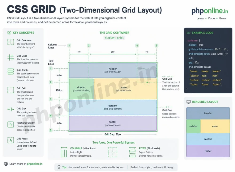
1. The Core Terminology of CSS Grid
Before diving into properties, let us establish the standard vocabulary used in two-dimensional grid architecture:
- Grid Container: The parent HTML element where
display: grid;ordisplay: inline-grid;is declared. - Grid Items: The direct child elements nested inside the grid container box.
- Grid Lines: The numbered horizontal and vertical dividing lines that separate columns and rows (starting from line index 1).
- Grid Track: The space between any two adjacent grid lines (either a column track or a row track).
- Grid Cell: The single intersection space between a row track and a column track (the smallest unit in a grid).
- Grid Gap: The gutter space separating adjacent grid tracks horizontally and vertically.
/* Activating CSS Grid on a Parent Container */
.grid-container {
    display: grid; /* Direct children instantly become grid items inside a 2D layout engine! */
}
Want to test this CSS code live or build custom styles automatically? Try running it in our Online CSS Editor or generate instant layout rules with our AI CSS Generator.
2. Defining Columns, Rows, and Fractional Units (fr)
Grid containers use two primary properties to define explicit grid tracks: grid-template-columns and grid-template-rows.
The Fractional Unit (fr):
The fractional unit (fr) is a flexible unit unique to CSS Grid. It represents a fraction of the available free space remaining inside the grid container box.
/* Creating 3 Equal Columns (Each taking 1 fraction of free space) */
.grid-three-col {
    display: grid;
    grid-template-columns: 1fr 1fr 1fr;
}

/* Creating Asymmetric Columns: Sidebar (250px) and Main Content (3 fractions) */
.grid-sidebar-layout {
    display: grid;
    grid-template-columns: 250px 3fr;
}
Simplifying Tracks with the repeat() Function:
When declaring multiple columns or rows of identical sizes, use the repeat(count, track_size) function to keep your code clean:
/* Equivalent to writing: grid-template-columns: 1fr 1fr 1fr 1fr; */
.grid-four-col {
    display: grid;
    grid-template-columns: repeat(4, 1fr);
    gap: 20px; /* Adds 20px gutter gap between rows and columns */
}
Want to test this CSS code live or build custom styles automatically? Try running it in our Online CSS Editor or generate instant layout rules with our AI CSS Generator.
3. Grid Placement: Line Numbers and Span Controls
By default, grid items fill grid cells automatically in source order. However, you can explicitly position child items across multiple columns or rows using grid line numbers or the span keyword.
Grid Line Properties:
grid-column-start&grid-column-end: Defines the starting and ending vertical grid lines for an item.grid-row-start&grid-row-end: Defines the starting and ending horizontal grid lines for an item.grid-column(Shorthand): Acceptsstart / endorstart / span count.
/* Spanning a Header Banner across all 3 columns */
.hero-banner-item {
    /* Starts at column line 1 and spans across 3 column tracks */
    grid-column: 1 / span 3;
}

/* Spanning a Feature Card across 2 rows vertically */
.feature-tall-card {
    grid-row: 1 / span 2;
}
4. Visual Layouts with grid-template-areas
One of the most intuitive features of CSS Grid is grid-template-areas. It allows you to design entire webpage structural layouts visually using text maps, and then assign HTML components to those named grid areas using grid-area.
Step-by-Step Template Area Setup:
/* 1. Define the Master Template Area Layout on the Parent Container */
.page-layout {
    display: grid;
    grid-template-columns: 250px 1fr;
    grid-template-rows: auto 1fr auto;
    grid-template-areas:
        "header  header"
        "sidebar main"
        "footer  footer";
    min-height: 100vh;
    gap: 15px;
}

/* 2. Assign Child Elements to Named Grid Areas */
.site-header  { grid-area: header; }
.site-sidebar { grid-area: sidebar; }
.site-main    { grid-area: main; }
.site-footer  { grid-area: footer; }
Want to test this CSS code live or build custom styles automatically? Try running it in our Online CSS Editor or generate instant layout rules with our AI CSS Generator.
5. Responsive Auto-Fitting without Media Queries
CSS Grid introduces a revolutionary responsive technique: combining repeat(), auto-fit (or auto-fill), and the minmax() function.
This single line of CSS creates a fully responsive card grid that automatically rearranges columns based on available screen width—without writing a single @media query rule!
/* Responsive Magic: Auto-Fitting Multi-Column Card Grid */
.responsive-card-grid {
    display: grid;
    /* Columns will be at least 280px wide, expanding equally to fill leftover space */
    grid-template-columns: repeat(auto-fit, minmax(280px, 1fr));
    gap: 20px;
}
How it Works: The browser calculates how many 280px cards can fit into the current screen width. If the viewport shrinks below 280px per column, the grid automatically drops column counts and wraps cards onto new rows seamlessly!
6. CSS Flexbox vs. CSS Grid: How to Choose Correctly
Front-end developers often ask when to use Flexbox versus CSS Grid. Here is the golden decision rule:
| Layout Feature | CSS Flexbox (1D) | CSS Grid (2D) |
|---|---|---|
| Dimensional Focus | One-Dimensional (Row OR Column at a time). | Two-Dimensional (Rows AND Columns simultaneously). |
| Primary Design Paradigm | Content-first (Items dictate their own size and flow). | Layout-first (The container grid dictates item sizes). |
| Best Application Scenario | Navigation headers, form button groups, badge tags, media object components. | Full webpage layout shells, image photo galleries, complex dashboards, pricing tables. |
| Item Overlapping Support | Requires relative/absolute positioning hacks. | Native support (Grid items can overlap using line numbers). |
Best Practice: Flexbox and Grid are complementary tools! Use **CSS Grid** to build the overarching page layout structure, and use **Flexbox** inside individual grid components to align nested buttons, icons, and text links.
7. Complete Hands-on Page Layout Example
Below is a complete HTML document paired with a CSS stylesheet demonstrating a full webpage application shell using `grid-template-areas` and a responsive `minmax()` card gallery combined:
<!DOCTYPE html>
<html lang="en">
<head>
<meta charset="UTF-8">
<meta name="viewport" content="width=device-width, initial-scale=1.0">
<title>CSS Grid Layout Demonstration</title>
<style>
*, *::before, *::after {
box-sizing: border-box;
margin: 0;
padding: 0;
}
body {
font-family: Arial, sans-serif;
background-color: #f4f6f9;
color: #333;
}
/* 1. Master Web Page 2D Grid Architecture */
.app-shell {
display: grid;
grid-template-columns: 240px 1fr;
grid-template-rows: auto 1fr auto;
grid-template-areas:
"header header"
"sidebar main"
"footer footer";
min-height: 100vh;
}
/* 2. Assigning Areas */
.header {
grid-area: header;
background-color: #0073aa;
color: #ffffff;
padding: 20px;
}
.sidebar {
grid-area: sidebar;
background-color: #ffffff;
border-right: 1px solid #e0e0e0;
padding: 20px;
}
.main-content {
grid-area: main;
padding: 30px;
}
.footer {
grid-area: footer;
background-color: #212529;
color: #ffffff;
text-align: center;
padding: 15px;
}
/* 3. Responsive Inner Card Grid using minmax() */
.card-grid {
display: grid;
grid-template-columns: repeat(auto-fit, minmax(240px, 1fr));
gap: 20px;
margin-top: 20px;
}
.card {
background-color: #ffffff;
border: 1px solid #e0e0e0;
border-radius: 8px;
padding: 20px;
}
.card h3 {
color: #0073aa;
margin-bottom: 10px;
}
.card p {
line-height: 1.5;
}
</style>
</head>
<body>
<!-- Master App Shell -->
<div class="app-shell">
<header class="header">
<h1>PHPOnline Educational Portal (CSS Grid Shell)</h1>
</header>
<aside class="sidebar">
<h3 style="margin-bottom: 15px;">Course Menu</h3>
<ul style="list-style: none; line-height: 2;">
<li>• HTML5 Semantics</li>
<li>• CSS3 Box Model</li>
<li>• CSS Flexbox (1D)</li>
<li>• CSS Grid (2D)</li>
<li>• PHP 8 & MySQL</li>
</ul>
</aside>
<main class="main-content">
<h2>Two-Dimensional Grid Architecture</h2>
<p>This dashboard shell utilizes named grid areas for structural placement and minmax auto-fitting for the cards below:</p>
<!-- Nested Auto-Fit Card Gallery -->
<div class="card-grid">
<div class="card">
<h3>Grid Track 1</h3>
<p>Fluid columns configured using fractional units (1fr).</p>
</div>
<div class="card">
<h3>Grid Track 2</h3>
<p>Gutter spaces managed via explicit gap properties.</p>
</div>
<div class="card">
<h3>Grid Track 3</h3>
<p>Responsive auto-fitting without media queries.</p>
</div>
</div>
</main>
<footer class="footer">
<p>© 2026 PHPOnline Platform. All Rights Reserved.</p>
</footer>
</div>
</body>
</html>Want to test this CSS code live or build custom styles automatically? Try running it in our Online CSS Editor or generate instant layout rules with our AI CSS Generator.
Validating HTML and CSS Code Standards
Syntax typos in grid-template-areas string maps (such as having an unequal number of area names across rows) will cause the entire grid layout engine to fail.
Before publishing your web page layouts, validate your code syntax using our PHPOnline HTML Validator Tool.
Summary Comparison of Core Grid Properties
| CSS Property | Applies To | Sample Syntax | Primary Layout Function |
|---|---|---|---|
display: grid; | Parent Container | display: grid; | Activates 2D CSS Grid layout engine on parent and children. |
grid-template-columns | Parent Container | repeat(3, 1fr) | Defines the number and sizing tracks of vertical grid columns. |
grid-template-areas | Parent Container | "header header" "main side" | Maps out visual 2D page regions using intuitive text strings. |
gap | Parent Container | gap: 20px; | Sets exact horizontal and vertical gutter gaps between grid tracks. |
grid-column | Grid Child Item | 1 / span 3 | Positions an item across specific vertical grid lines or track spans. |
grid-area | Grid Child Item | grid-area: sidebar; | Assigns a child item to a named area defined in grid-template-areas. |
Troubleshooting Common CSS Grid Errors
| Observed Grid Issue | Probable Cause | Recommended Solution |
|---|---|---|
grid-template-areas layout collapses into raw stacked blocks | Typo in area names or mismatching column counts across area template rows. | Ensure every string row in grid-template-areas contains the exact same number of column cell names. |
| Fixed pixel column definitions overflow off small mobile viewports | Using fixed px column widths (e.g., 300px 300px 300px) instead of flexible fr units or minmax(). | Replace fixed pixel widths with fractional units (1fr) or responsive minmax(250px, 1fr) tracks. |
Child item grid-column: 1 / span 2; fails to span columns | The parent grid container does not have enough total columns defined to accommodate the requested span. | Verify total column tracks declared in grid-template-columns match or exceed the item span request. |
| Grid gap property creates unwanted outer margin around the entire container | Confusing gap with container padding (gap applies strictly *between* tracks, never around the outside edge). | Use padding on the parent container if you need outer boundary whitespace. Validate code with our HTML Validator Tool. |
Frequently Asked Questions (FAQ)
Q1: What is CSS Grid Layout and why is it fundamental?
CSS Grid Layout is a two-dimensional layout engine designed to align content in both rows and columns simultaneously. It simplifies complex webpage structures, multi-column card grids, and dashboard layouts with precise dimensional control.
Q2: What is the difference between CSS Flexbox and CSS Grid?
Flexbox is a one-dimensional layout system focused on aligning items along a single axis (row OR column). CSS Grid is a two-dimensional layout system designed to manage rows AND columns simultaneously. Flexbox is content-driven, whereas Grid is layout-driven.
Q3: What does the fr unit represent in CSS Grid?
The fr (fractional) unit represents a fraction of the available free space remaining inside the grid container box (e.g., 1fr 2fr splits space into 1/3 and 2/3 ratios).
Q4: How does repeat(auto-fit, minmax(280px, 1fr)) create responsive layouts?
This combination automatically calculates how many columns of at least 280px can fit into the current container width. When screen width shrinks, items wrap onto new rows automatically without writing media queries.
Course Progress & Official References
Congratulations on completing Module 3: Layouts & Positioning! You now possess master skills spanning the CSS display property, static/relative/absolute/fixed/sticky positioning schemes, z-index 3D stacking, 1D Flexbox alignment, and 2D Grid systems.
Consult official technical web standards on the MDN Official CSS Grid Guide (mozilla.org).
Before publishing your web page layouts, validate your code syntax using our PHPOnline HTML Validator Tool.
Ready to move to Module 4? Proceed directly to the first lesson in Module 4: Next Lesson: CSS Media Queries & Responsive Web Design →
# Summary
Here is what you've learned in this lesson:
- Easy CSS Grid Layouts Guide: 6 Essential Grid Properties & Examples
- Overview: Understanding CSS Grid Layouts & Two-Dimensional Web Design
- Prerequisites Before Building Grid Systems
- 1. The Core Terminology of CSS Grid
- 2. Defining Columns, Rows, and Fractional Units (fr)
- 3. Grid Placement: Line Numbers and Span Controls
- 4. Visual Layouts with grid-template-areas
- 5. Responsive Auto-Fitting without Media Queries
- 6. CSS Flexbox vs. CSS Grid: How to Choose Correctly
- 7. Complete Hands-on Page Layout Example
- Validating HTML and CSS Code Standards
- Summary Comparison of Core Grid Properties
- Troubleshooting Common CSS Grid Errors
- Frequently Asked Questions (FAQ)
- Course Progress & Official References
Continue to the next lesson and learn more about CSS Media Queries.