
CSS Flexbox
Easy CSS Flexbox Guide: 6 Core Flex Properties & Layout Examples
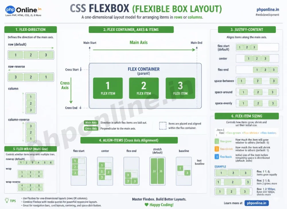
Master modern 1D web layouts with this complete CSS Flexbox guide. Learn flex-direction, justify-content, align-items, flex-wrap, and flex-grow alignment rules.
Estimated Read Time: 22 Minutes | Category: Web Development Fundamentals
Overview: Understanding CSS Flexbox & One-Dimensional Layouts
Quick CSS Flexbox Summary:
- 1D Layout Engine: CSS Flexbox (Flexible Box Layout Module) is designed to align items in a single direction—either horizontally in a row or vertically in a column.
- Parent Container & Child Items: Activating
display: flex;on a parent element automatically transforms all its direct children into flexible flex items. - The Dual Axes: Flexbox aligns elements along two perpendicular axes: the **Main Axis** (primary layout direction) and the **Cross Axis** (perpendicular alignment direction).
- Main-Axis Alignment (justify-content): Distributes flex items along the main axis using values like
flex-start,center,space-between, andspace-around. - Cross-Axis Alignment (align-items): Aligns items vertically across the cross axis using values like
stretch,center,flex-start, andflex-end.
Welcome to Lesson 10 of our structured Web Development curriculum. Following our previous lesson on Easy CSS Positioning Guide: 5 Core Position Schemes & Examples, you now understand how relative, absolute, fixed, and sticky schemes control element placement. The next major milestone in modern front-end engineering is building flexible UI layouts using CSS Flexbox.
Before Flexbox was introduced in CSS3, positioning side-by-side components (like navigation bars, pricing cards, or equal-height columns) required complex CSS hacks using float clearances, margin calculations, or inline-block vertical alignment tweaks. Flexbox eliminated these legacy hacks by providing an intelligent, component-level alignment engine that automatically calculates whitespace distribution, item scaling, and vertical centering.
In this comprehensive CSS Flexbox tutorial, we will explore flex containers, main vs. cross axes, directional rules, content distribution, cross-axis alignment, multi-line wrapping, child flex sizing (`flex-grow`, `flex-shrink`, `flex-basis`), and hands-on code examples.
Prerequisites Before Building Flex Layouts
To test the hands-on code examples in this CSS Flexbox guide, verify that your development environment meets these basic requirements:
- Web Browser: A modern web browser such as Google Chrome, Mozilla Firefox, Microsoft Edge, or Apple Safari.
- Code Editor: A text editor such as Visual Studio Code, Sublime Text, or Notepad++.
- Display Foundations: Solid understanding of block vs. inline elements and the CSS Box Model.
If you need to review how the display property converts default element box behaviors, visit our previous guide on Easy CSS Display Property Guide: 4 Core Display Values & Examples.
1. The Two Pillars of Flexbox: Container and Items
Flexbox operates on a parent-child hierarchy:
- Flex Container: The parent HTML element where
display: flex;ordisplay: inline-flex;is applied. - Flex Items: All direct child elements nested inside the flex container box.
/* Activating Flexbox on a Parent Container */
.flex-container {
    display: flex; /* Direct children instantly become flexible flex items! */
}
Want to test this CSS code live or build custom styles automatically? Try running it in our Online CSS Editor or generate instant layout rules with our AI CSS Generator.
2. Understanding Main Axis and Cross Axis
Flexbox alignment properties depend on two perpendicular axes:
- Main Axis: The primary axis along which flex items are laid out. By default (when
flex-direction: row;), the main axis runs horizontally from left to right. - Cross Axis: The axis perpendicular to the main axis. By default, the cross axis runs vertically from top to bottom.
Crucial Rule: If you change the flex direction to a vertical column (flex-direction: column;), the Main Axis becomes vertical and the Cross Axis becomes horizontal!
3. Flex Container Properties (Parent Rules)
1. flex-direction (Setting the Main Axis)
The flex-direction property establishes the main axis direction:
row(Default): Items align horizontally from left to right.row-reverse: Items align horizontally from right to left.column: Items align vertically from top to bottom.column-reverse: Items align vertically from bottom to top.
.navbar {
    display: flex;
    flex-direction: row; /* Horizontal alignment */
}
2. justify-content (Aligning Along Main Axis)
The justify-content property manages how extra whitespace is distributed along the **Main Axis**:
| justify-content Value | Main-Axis Alignment Behavior |
|---|---|
flex-start (Default) | Packs items tightly toward the start edge of the main axis. |
flex-end | Packs items tightly toward the end edge of the main axis. |
center | Gathers all flex items in the absolute center of the main axis. |
space-between | Distributes items evenly; first item touches start edge, last item touches end edge. |
space-around | Distributes items with equal whitespace on both sides of every item. |
space-evenly | Distributes items so that gaps between any two items (and edges) are identical. |
/* Header Navigation with Logo on Left and Links on Right */
.header-bar {
    display: flex;
    justify-content: space-between; /* Pushes logo left and links right */
    align-items: center;
}
Want to test this CSS code live or build custom styles automatically? Try running it in our Online CSS Editor or generate instant layout rules with our AI CSS Generator.
3. align-items (Aligning Along Cross Axis)
The align-items property manages vertical alignment across the **Cross Axis**:
stretch(Default): Stretches flex items to fill the full height of the container.center: Centers flex items vertically across the cross axis (Perfect for vertical centering!).flex-start: Aligns items at the top edge of the cross axis.flex-end: Aligns items at the bottom edge of the cross axis.baseline: Aligns flex items so that their text baselines line up perfectly.
/* Perfect Vertical and Horizontal Centering */
.hero-center {
    display: flex;
    justify-content: center; /* Horizontally centered */
    align-items: center;     /* Vertically centered */
    min-height: 300px;
}
4. flex-wrap and gap (Multi-Line Rows & Spacing)
By default, flex items force themselves onto a single line, shrinking if necessary. Setting flex-wrap: wrap; allows items to wrap cleanly onto new lines when horizontal space runs out.
The modern gap property sets exact spacing gaps between flex items without using traditional margin hacks:
.card-grid {
    display: flex;
    flex-wrap: wrap;
    gap: 20px; /* Adds 20px space between both rows and columns */
}
Want to test this CSS code live or build custom styles automatically? Try running it in our Online CSS Editor or generate instant layout rules with our AI CSS Generator.
4. Flex Item Properties (Child Rules)
Flexbox also provides properties applied directly to child flex items:
1. flex-grow, flex-shrink, and flex-basis
flex-grow: A number defining how much an item expands relative to sibling items to fill extra leftover space (e.g.,flex-grow: 1;).flex-shrink: A number defining how much an item shrinks relative to sibling items when container space is tight (Default:1).flex-basis: Sets the initial default size of an item before extra space is distributed (e.g.,flex-basis: 250px;).
The flex Shorthand Syntax:
Combine flex child controls using the flex shorthand: **grow → shrink → basis**:
/* Child Flex Item Shorthand: flex: grow shrink basis */
.sidebar {
    flex: 0 0 250px; /* Fixed 250px width: Won't grow, won't shrink */
}

.main-content {
    flex: 1 1 auto; /* Flexible main area: Expands to fill all remaining space */
}
2. align-self (Individual Override)
The align-self property allows a single flex child to override the parent’s global align-items setting:
.special-badge {
    align-self: flex-start; /* Overrides parent container's align-items */
}
5. Summary Comparison of Core Flexbox Properties
| CSS Property | Applies To | Sample Syntax | Primary Layout Purpose |
|---|---|---|---|
display: flex; | Parent Container | display: flex; | Activates Flexbox layout behavior on parent and children. |
flex-direction | Parent Container | row / column | Establishes the Main Axis direction (horizontal vs. vertical). |
justify-content | Parent Container | space-between / center | Aligns and distributes items along the Main Axis. |
align-items | Parent Container | center / stretch | Aligns items vertically across the Cross Axis. |
gap | Parent Container | gap: 20px; | Sets exact spacing gaps between flex rows and columns. |
flex | Child Item | flex: 1 1 300px; | Shorthand controlling child growth, shrinkage, and base size. |
6. Complete Hands-on Responsive Layout Example
Below is a complete HTML document paired with a CSS stylesheet demonstrating a modern header navbar and a responsive multi-card grid using Flexbox:
<!DOCTYPE html>
<html lang="en">
<head>
<meta charset="UTF-8">
<meta name="viewport" content="width=device-width, initial-scale=1.0">
<title>CSS Flexbox Layout Demonstration</title>
<style>
*, *::before, *::after {
box-sizing: border-box;
margin: 0;
padding: 0;
}
body {
font-family: Arial, sans-serif;
background-color: #f4f6f9;
color: #333;
}
/* 1. Flex Header Navigation Bar */
.navbar {
display: flex;
justify-content: space-between; /* Logo left, links right */
align-items: center; /* Vertical centering */
background-color: #0073aa;
padding: 15px 30px;
color: #ffffff;
}
.nav-links {
display: flex;
gap: 20px; /* Space between menu links */
list-style: none;
}
.nav-links a {
color: #ffffff;
text-decoration: none;
font-weight: bold;
}
.container {
max-width: 1000px;
margin: 30px auto;
padding: 0 20px;
}
/* 2. Flex Card Grid with Multi-Line Wrapping */
.card-grid {
display: flex;
flex-wrap: wrap; /* Allows wrapping on smaller viewports */
gap: 20px; /* Uniform gaps between cards */
}
/* Flex Child Items */
.card {
flex: 1 1 280px; /* Grows, shrinks, base width 280px */
background-color: #ffffff;
border: 1px solid #e0e0e0;
border-radius: 8px;
padding: 20px;
display: flex;
flex-direction: column; /* Stacks card text vertically */
justify-content: space-between;
}
.card h3 {
color: #0073aa;
margin-bottom: 10px;
}
.card p {
line-height: 1.5;
margin-bottom: 15px;
}
.btn {
display: inline-block;
background-color: #0073aa;
color: #ffffff;
text-decoration: none;
padding: 10px 15px;
border-radius: 4px;
text-align: center;
}
</style>
</head>
<body>
<!-- Flex Header Navbar -->
<header class="navbar">
<h2>PHPOnline Portal</h2>
<ul class="nav-links">
<li><a href="#">HTML</a></li>
<li><a href="#">CSS3</a></li>
<li><a href="#">PHP 8</a></li>
<li><a href="#">MySQL</a></li>
</ul>
</header>
<div class="container">
<h1 style="margin-bottom: 20px;">Featured Web Modules</h1>
<!-- Responsive Flex Card Grid -->
<div class="card-grid">
<div class="card">
<div>
<h3>CSS Flexbox Architecture</h3>
<p>Master 1D horizontal and vertical alignments using flexible flex container properties.</p>
</div>
<a href="#" class="btn">Start Module</a>
</div>
<div class="card">
<div>
<h3>CSS Grid Masterclass</h3>
<p>Build complex 2D web page layouts using grid templates, tracks, and explicit gap areas.</p>
</div>
<a href="#" class="btn">Start Module</a>
</div>
<div class="card">
<div>
<h3>PHP 8 & MySQL PDO</h3>
<p>Engineering secure backend web applications using prepared statements and Object-Oriented PHP.</p>
</div>
<a href="#" class="btn">Start Module</a>
</div>
</div>
</div>
</body>
</html>Want to test this CSS code live or build custom styles automatically? Try running it in our Online CSS Editor or generate instant layout rules with our AI CSS Generator.
Validating HTML and CSS Code Standards
Applying flex child properties (like flex-grow or align-self) on elements whose parent container lacks display: flex; will result in ignored styles.
Before publishing your web page layouts, validate your code syntax using our PHPOnline HTML Validator Tool.
Troubleshooting Common Flexbox Layout Errors
| Observed Flexbox Issue | Probable Cause | Recommended Solution |
|---|---|---|
| Flex items shrink excessively and distort layout images on smaller screens | Default flex-shrink: 1; causing items to compress below intended limits. | Set flex-shrink: 0; on the flex child or apply flex-wrap: wrap; to the parent container. |
justify-content: center; fails to align items vertically | Confusing the Main Axis with the Cross Axis when flex-direction is set to row. | Use justify-content for main-axis horizontal alignment and align-items for cross-axis vertical alignment. |
| Items overflow off screen horizontally without wrapping to new lines | Missing flex-wrap: wrap; on the parent flex container (Flexbox defaults to nowrap). | Add flex-wrap: wrap; to allow items to flow naturally onto new lines. |
| Flex child alignment properties have zero effect | Forgetting to declare display: flex; on the parent element box. | Ensure the direct parent container has display: flex; applied. Validate code with our HTML Validator Tool. |
Frequently Asked Questions (FAQ)
Q1: What is CSS Flexbox and why is it fundamental?
CSS Flexbox (Flexible Box Layout) is a 1D CSS layout model designed to align items in a single direction (row or column). It automates space distribution, item scaling, and vertical centering without using float clearance hacks.
Q2: What is the difference between justify-content and align-items in Flexbox?
justify-content aligns items along the **Main Axis** (horizontal by default). align-items aligns items across the **Cross Axis** (vertical by default).
Q3: What is the difference between flex-direction: row and flex-direction: column?
flex-direction: row arranges flex items horizontally in a line from left to right. flex-direction: column stacks flex items vertically in a column from top to bottom, flipping the main and cross axes.
Q4: How does flex-wrap: wrap improve responsive web design?
By default, Flexbox forces all items onto a single line (nowrap). Adding flex-wrap: wrap; allows flex items to wrap onto additional rows when horizontal screen width is restricted, preventing layout clipping on mobile devices.
Next Steps & Official References
Consult official technical web standards on the MDN Official CSS Flexbox Guide (mozilla.org).
Before publishing your web page layouts, validate your code syntax using our PHPOnline HTML Validator Tool.
Ready for the final lesson in Module 3? Proceed directly to the final lesson in Module 3: Next Lesson: CSS Grid Layouts (2D Grids, Templates, Tracks, Areas) →
# Summary
Here is what you've learned in this lesson:
- Easy CSS Flexbox Guide: 6 Core Flex Properties & Layout Examples
- Overview: Understanding CSS Flexbox & One-Dimensional Layouts
- Prerequisites Before Building Flex Layouts
- 1. The Two Pillars of Flexbox: Container and Items
- 2. Understanding Main Axis and Cross Axis
- 3. Flex Container Properties (Parent Rules)
- 4. Flex Item Properties (Child Rules)
- 5. Summary Comparison of Core Flexbox Properties
- 6. Complete Hands-on Responsive Layout Example
- Validating HTML and CSS Code Standards
- Troubleshooting Common Flexbox Layout Errors
- Frequently Asked Questions (FAQ)
- Next Steps & Official References
Continue to the next lesson and learn more about CSS Grid Layouts.