
CSS Positioning
Easy CSS Positioning Guide: 5 Core Position Schemes & Examples
Master element placement with this complete CSS positioning guide. Learn static, relative, absolute, fixed, sticky, and z-index stacking context rules.
Estimated Read Time: 21 Minutes | Category: Web Development Fundamentals
Overview: Understanding CSS Positioning & Element Placement
Quick CSS Positioning Summary:
- Document Flow Control: The
positionproperty dictates how an element is placed inside the browser layout, allowing developers to pull elements out of standard document flow. - 5 Position Schemes: CSS provides five distinct positioning schemes:
static(default flow),relative(self-offset),absolute(ancestor-offset),fixed(viewport-pinned), andsticky(scroll-dependent pinning). - The Offset Attributes: Positioned elements are placed in 2D space using the
top,right,bottom, andleftoffset properties. - The Relative-Absolute Pair Pattern: Setting
position: relative;on a parent container creates an anchor origin for child elements usingposition: absolute;. - 3D Z-Axis Stacking (z-index): The
z-indexproperty controls the vertical overlap order of positioned elements, managing tooltips, dropdowns, and modal dialog overlays.
Welcome to Lesson 9 of our structured Web Development curriculum. Following our previous lesson on Easy CSS Display Property Guide: 4 Core Display Values & Examples, you now understand how block, inline, and inline-block element boxes flow horizontally and vertically. The next vital step in building dynamic web interfaces is placing components precisely using CSS positioning.
Standard document flow places elements sequentially from top to bottom and left to right. However, modern user interfaces frequently require elements to break out of this natural sequence—such as pinning navigation headers to the top of the browser window during scrolling, overlaying notification badges on notification icons, or locking “Back to Top” buttons in the bottom corner of the viewport.
In this comprehensive CSS positioning guide, we will explore the 5 core positioning values (`static`, `relative`, `absolute`, `fixed`, `sticky`), offset mechanics (`top`, `right`, `bottom`, `left`), parent-child anchor patterns, 3D `z-index` stacking contexts, and hands-on code examples.
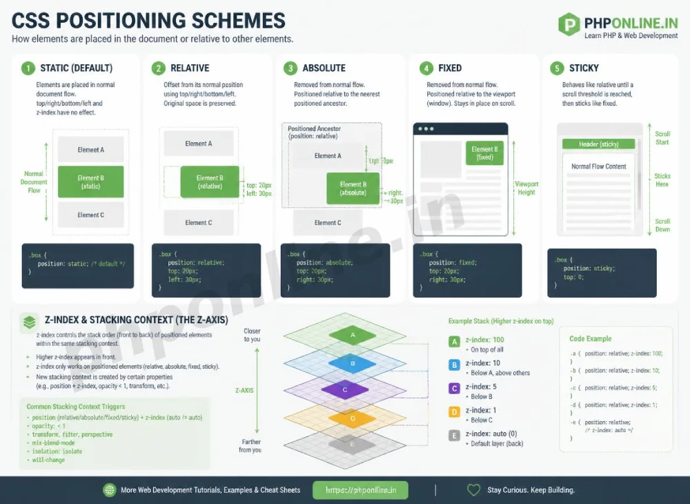
Prerequisites Before Positioning Elements
To test the hands-on code examples in this CSS positioning tutorial, verify that your development environment meets these basic requirements:
- Web Browser: A modern web browser such as Google Chrome, Mozilla Firefox, Microsoft Edge, or Apple Safari.
- Code Editor: A text editor such as Visual Studio Code, Sublime Text, or Notepad++.
- Display Foundations: Solid understanding of block vs. inline element box behavior and display properties.
If you need to review how block and inline elements behave before shifting their position, visit our previous guide on Easy CSS Display Property Guide: 4 Core Display Values & Examples.
1. Static Positioning (position: static) — The Default Flow
position: static; is the default positioning scheme for every HTML element. Static elements follow the normal page document flow, rendering in the exact order they appear in your HTML source code.
Key Behaviors of position: static:
- Normal Flow: Elements stack block-by-block vertically or flow inline horizontally.
- Ignores Offsets: **Ignores top, right, bottom, and left properties entirely!**
- Ignores z-index: Static elements do not create or respond to custom
z-indexstacking layer orders.
/* Standard static element (explicitly declared for demonstration) */
.box-static {
    position: static;
    /* top: 20px; -> IGNORED by browser parser! */
}
2. Relative Positioning (position: relative) — Self-Offsetting
An element with position: relative; remains in the normal document flow, but can be shifted from its original baseline position using offset values (top, right, bottom, left).
Key Behaviors of position: relative:
- Preserves Original Space: The element shifts visually, but the browser **reserves its original physical layout space**. Surrounding elements do not move to fill the empty gap!
- Anchor for Absolute Children: Serves as the positioning context (anchor boundary) for any child element using
position: absolute;. - Enables z-index: Allows custom layer stacking order via the
z-indexproperty.
/* Shifts box 20px down and 30px right from its original starting position */
.box-relative {
    position: relative;
    top: 20px;
    left: 30px;
    background-color: #e3f2fd;
}
Want to test this CSS code live or build custom styles automatically? Try running it in our Online CSS Editor or generate instant layout rules with our AI CSS Generator.
3. Absolute Positioning (position: absolute) — The Floating Pinpoint
An element with position: absolute; is completely **removed from the normal document flow**. Surrounding elements collapse and behave as if the absolute element does not exist!
How Absolute Positioning Locates Its Origin:
An absolute element positions itself relative to its **nearest positioned ancestor** (any ancestor element with position set to relative, absolute, fixed, or sticky). If no positioned ancestor exists, it aligns relative to the root <html> document viewport.
The Golden Relative-Absolute Design Pattern:
To position an absolute badge or close button in the top-right corner of a card component, wrap the card in position: relative; and set the child element to position: absolute;:
/* 1. Parent Container acts as the positioning anchor */
.card-parent {
    position: relative; /* Anchor Boundary */
    width: 300px;
    padding: 20px;
    background-color: #ffffff;
    border: 1px solid #ddd;
}

/* 2. Absolute Child pins itself to the top-right corner of the parent */
.badge-child {
    position: absolute;
    top: -10px;
    right: -10px;
    background-color: #e65100;
    color: #ffffff;
    padding: 4px 8px;
    font-size: 12px;
    border-radius: 12px;
}
Want to test this CSS code live or build custom styles automatically? Try running it in our Online CSS Editor or generate instant layout rules with our AI CSS Generator.
4. Fixed Positioning (position: fixed) — Viewport Pinning
An element with position: fixed; is removed from the document flow and pinned relative to the **browser viewport window**.
Key Behaviors of position: fixed:
- Locked On Scroll: Remains locked in the exact same visual screen coordinates when the user scrolls the page.
- Viewport Relative: Position offsets (
top,right,bottom,left) are calculated directly against browser window edges, ignoring parent container boundaries. - Common Applications: Fixed top navigation bars, cookie consent banners, floating live-chat icons, and sticky “Back to Top” buttons.
/* Fixed Top Navigation Bar */
.navbar-fixed {
    position: fixed;
    top: 0;
    left: 0;
    width: 100%;
    height: 60px;
    background-color: #0073aa;
    color: #ffffff;
    z-index: 1000; /* Keeps bar above all scrolling content */
}
5. Sticky Positioning (position: sticky) — Hybrid Scroll Pinning
position: sticky; is a hybrid scheme that toggles between relative and fixed based on the user’s scroll position.
Key Behaviors of position: sticky:
- Relative First, Fixed Second: Behaves as a normal relative element until the user scrolls past a specified offset threshold (e.g.,
top: 0;), at which point it pins itself in place like a fixed element! - Parent Constrained: Unpins itself automatically once the user scrolls past the bottom edge of its parent container.
- Mandatory Requirement: You **must** declare at least one offset property (such as
top: 0;) for sticky positioning to activate!
/* Sticky Table Header */
th {
    position: sticky;
    top: 0; /* Activates sticky pinning when top edge hits top of viewport */
    background-color: #f2f2f2;
    z-index: 10;
}
Want to test this CSS code live or build custom styles automatically? Try running it in our Online CSS Editor or generate instant layout rules with our AI CSS Generator.
6. Controlling 3D Overlaps with z-index
When positioned elements overlap on screen, CSS uses the z-index property to determine which element renders on top along the 3D Z-axis (towards or away from the screen).
Rules of z-index Stacking:
z-indexaccepts positive or negative integers (e.g.,z-index: 1;,z-index: 999;,z-index: -1;). Higher numbers render in front of lower numbers.z-indexworks **only on positioned elements** (elements withpositionset torelative,absolute,fixed, orsticky). It has no effect onposition: staticelements!
/* Modal Overlay Stacking Example */
.modal-overlay {
    position: fixed;
    top: 0;
    left: 0;
    width: 100%;
    height: 100%;
    background-color: rgba(0, 0, 0, 0.6);
    z-index: 500; /* Behind modal box, above page content */
}

.modal-content {
    position: fixed;
    top: 50%;
    left: 50%;
    transform: translate(-50%, -50%);
    background-color: #ffffff;
    padding: 30px;
    z-index: 1000; /* Renders in front of overlay */
}
7. Summary Comparison of the 5 CSS Position Schemes
| position Value | Document Flow Impact | Offset Origin Boundary | Locks On Scroll? | Primary Application Scenario |
|---|---|---|---|---|
static | Normal flow | None (Offsets ignored) | No | Default browser layout behavior for all HTML elements. |
relative | Normal flow (Space reserved) | Element’s own baseline starting position | No | Self-offsetting, and acting as an anchor parent for absolute children. |
absolute | Removed from flow | Nearest positioned ancestor (or <html>) | No | Badges, close icons, dropdown menus, custom tooltips inside cards. |
fixed | Removed from flow | Browser Viewport Window | Yes | Sticky top headers, floating chat buttons, modal backdrops. |
sticky | Normal flow until threshold | Scroll container / Viewport boundary | Yes (Until parent ends) | Sticky table headers, category filter bars, sticky blog sidebars. |
8. Complete Hands-on Demonstration Example
Below is a complete HTML document paired with a CSS stylesheet demonstrating fixed headers, relative-absolute card badges, and sticky sub-headers combined:
<!DOCTYPE html>
<html lang="en">
<head>
<meta charset="UTF-8">
<meta name="viewport" content="width=device-width, initial-scale=1.0">
<title>CSS Positioning Demonstration</title>
<style>
*, *::before, *::after {
box-sizing: border-box;
margin: 0;
padding: 0;
}
body {
font-family: Arial, sans-serif;
background-color: #f4f6f9;
color: #333;
padding-top: 70px; /* Space for fixed navbar */
}
/* 1. Fixed Header */
.fixed-nav {
position: fixed;
top: 0;
left: 0;
width: 100%;
height: 60px;
background-color: #0073aa;
color: #ffffff;
display: flex;
align-items: center;
padding: 0 20px;
z-index: 1000;
}
.container {
max-width: 800px;
margin: 0 auto;
padding: 20px;
}
/* 2. Sticky Category Bar */
.sticky-bar {
position: sticky;
top: 60px; /* Offset by fixed header height */
background-color: #e3f2fd;
border: 1px solid #90caf9;
padding: 12px;
margin-bottom: 20px;
font-weight: bold;
z-index: 100;
}
/* 3. Relative Parent Card */
.card {
position: relative; /* Anchor for absolute badge */
background-color: #ffffff;
border: 1px solid #e0e0e0;
border-radius: 8px;
padding: 25px;
margin-bottom: 20px;
}
/* 4. Absolute Child Badge */
.card-badge {
position: absolute;
top: 15px;
right: 15px;
background-color: #e65100;
color: #ffffff;
font-size: 12px;
font-weight: bold;
padding: 4px 10px;
border-radius: 12px;
}
</style>
</head>
<body>
<!-- Fixed Header -->
<div class="fixed-nav">
<h3>PHPOnline Academy (Fixed Navigation)</h3>
</div>
<div class="container">
<!-- Sticky Category Filter Bar -->
<div class="sticky-bar">
Sticky Category Filter (Pins below fixed header when scrolling)
</div>
<!-- Relative Card with Absolute Badge -->
<div class="card">
<span class="card-badge">HOT COURSE</span>
<h2>CSS Positioning Architecture</h2>
<p>
Learn how relative parents anchor absolute children, while fixed and sticky properties manage scroll pinning.
</p>
</div>
<div class="card">
<span class="card-badge">NEW</span>
<h2>PHP 8 & MySQL PDO Engineering</h2>
<p>
Develop secure database-driven backend web applications using prepared statements and object-oriented PHP.
</p>
</div>
</div>
</body>
</html>Want to test this CSS code live or build custom styles automatically? Try running it in our Online CSS Editor or generate instant layout rules with our AI CSS Generator.
Validating HTML and CSS Code Standards
Forgetting position: relative; on a parent card can cause child position: absolute; badges to shoot across the screen and attach to the main page body unexpectedly.
Before publishing your web page layouts, validate your code syntax using our PHPOnline HTML Validator Tool.
Troubleshooting Common CSS Positioning Errors
| Observed Positioning Issue | Probable Cause | Recommended Solution |
|---|---|---|
| An absolute child element flies off to the top-right of the entire window instead of its parent card | Forgetting to declare position: relative; on the parent container box. | Add position: relative; to the parent container to establish an anchor context. |
| Fixed top header overlaps the top portion of body page content | Fixed elements are removed from standard document flow, so subsequent content moves up behind them. | Add top padding or margin to the <body> element equal to the height of the fixed header (e.g., padding-top: 60px;). |
position: sticky; fails to pin when scrolling | Forgetting to specify a required offset property (like top: 0;), or an ancestor container has overflow: hidden; enabled. | Declare an explicit offset (e.g., top: 0;) and check ancestor elements for overflow: hidden;. |
z-index declaration has zero effect on an element’s stacking layer | Applying z-index to an element with position: static; (the default). | Add position: relative; to the element so it respects z-index rules. Validate code with our HTML Validator Tool. |
Frequently Asked Questions (FAQ)
Q1: What is CSS positioning and why is it fundamental?
CSS positioning is the property set used to control how elements are placed in 2D layout space. It allows developers to override default document flow to create fixed header bars, sticky sidebars, floating badges, and overlapping modal overlays.
Q2: What is the difference between relative and absolute positioning in CSS?
position: relative keeps an element in standard document flow while allowing visual offsets from its baseline starting position (it also acts as an anchor for absolute children). position: absolute removes an element completely from document flow, positioning it relative to its nearest positioned ancestor.
Q3: What is the relative-absolute positioning design pattern?
The relative-absolute design pattern involves assigning position: relative; to a parent box (like a card) and position: absolute; to a child element (like a badge or close button). This anchors the absolute child precisely to the parent’s boundaries.
Q4: How does z-index work and why does it require a positioned element?
z-index controls the 3D stacking order of overlapping elements along the Z-axis. It works only on positioned elements (relative, absolute, fixed, or sticky) because static elements follow standard 2D document flow rules exclusively.
Next Steps & Official References
Consult official technical web standards on the MDN Official CSS Position Reference (mozilla.org).
Before publishing your web page layouts, validate your code syntax using our PHPOnline HTML Validator Tool.
Ready for the next lesson in sequence? Proceed directly to the next lesson in Module 3: Next Lesson: CSS Flexbox Layouts (Flex Container, Direction, Alignment) →
# Summary
Here is what you've learned in this lesson:
- Easy CSS Positioning Guide: 5 Core Position Schemes & Examples
- Overview: Understanding CSS Positioning & Element Placement
- Prerequisites Before Positioning Elements
- 1. Static Positioning (position: static) — The Default Flow
- 2. Relative Positioning (position: relative) — Self-Offsetting
- 3. Absolute Positioning (position: absolute) — The Floating Pinpoint
- 4. Fixed Positioning (position: fixed) — Viewport Pinning
- 5. Sticky Positioning (position: sticky) — Hybrid Scroll Pinning
- 6. Controlling 3D Overlaps with z-index
- 7. Summary Comparison of the 5 CSS Position Schemes
- 8. Complete Hands-on Demonstration Example
- Validating HTML and CSS Code Standards
- Troubleshooting Common CSS Positioning Errors
- Frequently Asked Questions (FAQ)
- Next Steps & Official References
Continue to the next lesson and learn more about CSS Flexbox.