
CSS Typography
Easy CSS Typography Guide: 6 Essential Font Properties & Examples
Master web text styling with this complete CSS typography guide. Learn font-family stacks, Google Web Fonts, font-size units, line-height, and text alignment.
Estimated Read Time: 20 Minutes | Category: Web Development Fundamentals
Overview: Understanding CSS Typography & Web Fonts
Quick CSS Typography Summary:
- Digital Text Formatting: CSS typography controls the visual styling, readability, hierarchy, and spatial arrangement of written text on web pages.
- Font Stacks & Fallbacks: The
font-familyproperty defines a prioritized list of font names, ending with a generic system fallback (e.g.,sans-serif). - Sizing Units (px vs. rem vs. em): Modern responsive typography uses relative units like
rem(root em) andemrather than fixed absolute pixels (px). - Line Spacing & Readability: Setting an optimal
line-height(typically1.5to1.6for body text) dramatically improves readability across screen sizes. - External Web Fonts: Custom web fonts (such as Google Fonts) are imported into CSS using the
@importrule or linked inside the HTML<head>section.
Welcome to Lesson 4 of our structured Web Development curriculum, marking the final lesson in Module 1: CSS Basics & Styling Fundamentals. Following our previous lesson on Easy CSS Colors and Backgrounds Guide: 6 Core Color Formats & Examples, you now understand how color spaces, background images, and CSS gradients work. The next critical step in front-end design is controlling text presentation using CSS typography.
Text accounts for over 90% of the information delivered across the web. No matter how impressive your color palette or layout grid may be, poor typography—such as tiny font sizes, tight line spacing, or unreadable font choices—will cause visitors to leave your site immediately. Mastering CSS typography allows you to establish clear visual headings, comfortable reading rhythms, and distinct brand identities.
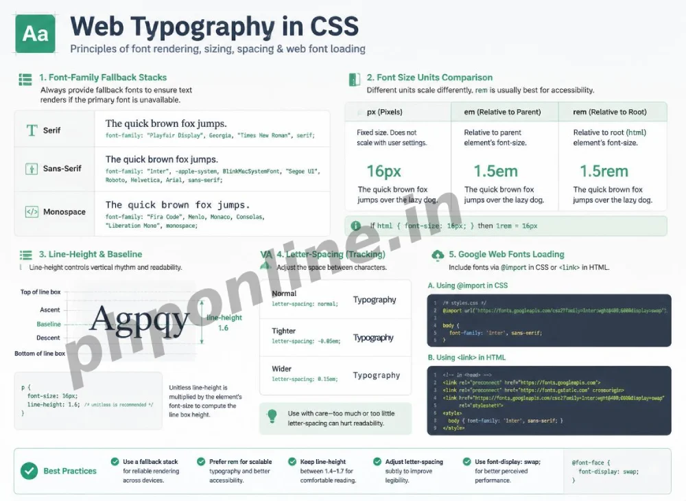
In this comprehensive CSS typography guide, we will explore font families, font fallback stacks, absolute versus relative units (`px`, `em`, `rem`), line-height spacing, text alignment, Google Web Fonts integration, and hands-on code examples.
Prerequisites Before Styling Web Typography
To test the hands-on code examples in this CSS typography tutorial, verify that your development environment meets these basic requirements:
- Web Browser: A modern web browser such as Google Chrome, Mozilla Firefox, Microsoft Edge, or Apple Safari.
- Code Editor: A text editor such as Visual Studio Code, Sublime Text, or Notepad++.
- CSS Syntax Foundations: Understanding of CSS selectors, rule sets, and background properties.
If you need to review how CSS rule sets target specific HTML elements, visit our previous guide on Easy CSS Syntax and Selectors Guide: 5 Core Selector Types & Examples.
1. The font-family Property & Fallback Stacks
The font-family property sets the typeface applied to text elements. Because users’ computers have different pre-installed fonts, developers specify a prioritized list of font choices known as a **Font Fallback Stack**:
/* Standard Sans-Serif Font Stack */
body {
    font-family: 'Helvetica Neue', Arial, sans-serif;
}
How the Browser Evaluates a Font Stack:
- The browser checks if the user’s computer has
'Helvetica Neue'installed. If found, it uses it. - If
'Helvetica Neue'is missing, it falls back to check forArial. - If
Arialis also missing, it defaults to the operating system’s defaultsans-serifsystem font.
Syntax Rule: Font names containing spaces (like 'Helvetica Neue' or 'Times New Roman') must always be wrapped in single or double quotes.
Generic Font Classification Categories:
| Generic Family | Visual Characteristics | Sample Common System Fonts | Best Application Scenario |
|---|---|---|---|
sans-serif | Clean, modern strokes without decorative end ticks. | Arial, Helvetica, Verdana, Trebuchet MS | Industry Standard: Digital body text and user interfaces. |
serif | Traditional strokes with decorative end ticks (serifs). | Times New Roman, Georgia, Garamond | Editorial articles, printed press styles, formal literature. |
monospace | Fixed-width characters where every letter takes equal horizontal space. | Courier New, Consolas, Monaco | Formatting code blocks, terminal outputs, technical data. |
2. Typography Sizing Units: px vs. em vs. rem
Setting font sizes using appropriate units is critical for building accessible, responsive web designs.
A. Pixels (px) — Absolute Unit
Pixels are fixed absolute units. Setting font-size: 16px; forces text to remain exactly 16 pixels tall regardless of the user’s screen or browser settings. While predictable, absolute pixel sizing harms accessibility because it overrides user browser font size preferences:
h1 {
    font-size: 32px; /* Fixed absolute size */
}
B. Rem (Root Em) — Modern Recommended Unit
The rem unit is relative to the root <html> element’s default font size (which is 16px in almost all default browser configurations).
1rem= 16px (1 × 16px)1.5rem= 24px (1.5 × 16px)2rem= 32px (2 × 16px)
Using rem units allows your web page typography to scale smoothly if a user adjusts their default browser text size settings for accessibility:
/* Responsive rem sizing */
h1 {
    font-size: 2rem; /* Equals 32px by default */
}

p {
    font-size: 1rem; /* Equals 16px by default */
}
Want to test this CSS code live or build custom styles automatically? Try running it in our Online CSS Editor or generate instant layout rules with our AI CSS Generator.
3. Core CSS Text Formatting Properties
Beyond font families and sizes, CSS provides properties to control weight, line spacing, alignment, and letter tracking:
A. font-weight
Controls text thickness. Values can be keywords (normal, bold) or numeric values ranging from 100 (Ultra Light) to 900 (Ultra Bold), where 400 is regular body text and 700 is bold:
.card-title {
    font-weight: 700; /* Bold text */
}
B. line-height (Line Spacing)
Sets the vertical distance between lines of text. For body paragraphs, optimal reading comfort requires a unitless ratio between 1.5 and 1.6:
p {
    font-size: 1rem;
    line-height: 1.6; /* 1.6 times the font size */
}
C. text-align
Controls horizontal text alignment within its parent container (left, center, right, or justify):
.banner-title {
    text-align: center;
}
D. letter-spacing and text-transform
letter-spacing adjusts the horizontal spacing between characters, while text-transform alters capitalization (uppercase, lowercase, capitalize):
.badge-label {
    text-transform: uppercase;
    letter-spacing: 1.5px;
    font-size: 0.85rem;
}
Want to test this CSS code live or build custom styles automatically? Try running it in our Online CSS Editor or generate instant layout rules with our AI CSS Generator.
4. Importing Google Web Fonts
System fonts like Arial or Times New Roman work everywhere, but custom web fonts give websites a distinct visual identity. Services like Google Fonts provide hundreds of free, open-source custom typefaces.
Two Ways to Import Google Fonts:
Method 1: Linking in HTML <head> (Recommended)
<!-- Include in HTML <head> section -->
<link rel="preconnect" href="https://fonts.googleapis.com">
<link rel="preconnect" href="https://fonts.gstatic.com" crossorigin>
<link href="https://fonts.googleapis.com/css2?family=Roboto:wght@400;700&display=swap" rel="stylesheet">
Method 2: Importing in CSS using @import
/* Place at the very top of your external CSS file */
@import url('https://fonts.googleapis.com/css2?family=Roboto:wght@400;700&display=swap');

body {
    font-family: 'Roboto', sans-serif;
}
5. Complete Typography Layout Example
Below is a complete HTML document paired with a CSS stylesheet demonstrating font stacks, `rem` sizing, line heights, uppercase labels, and custom web fonts combined:
<!DOCTYPE html>
<html lang="en">
<head>
<meta charset="UTF-8">
<meta name="viewport" content="width=device-width, initial-scale=1.0">
<title>CSS Typography Demonstration</title>
<!-- Google Fonts Link -->
<link rel="preconnect" href="https://fonts.googleapis.com">
<link rel="preconnect" href="https://fonts.gstatic.com" crossorigin>
<link href="https://fonts.googleapis.com/css2?family=Inter:wght@400;600;700&display=swap" rel="stylesheet">
<style>
* {
margin: 0;
padding: 0;
box-sizing: border-box;
}
body {
font-family: 'Inter', Arial, sans-serif;
background-color: #f8f9fa;
color: #212529;
padding: 30px;
max-width: 800px;
margin: 0 auto;
}
.category-tag {
display: inline-block;
font-size: 0.75rem;
font-weight: 700;
text-transform: uppercase;
letter-spacing: 1.2px;
color: #0073aa;
margin-bottom: 8px;
}
h1 {
font-size: 2.25rem;
font-weight: 700;
line-height: 1.2;
color: #111827;
margin-bottom: 16px;
}
p.lead-text {
font-size: 1.125rem;
line-height: 1.6;
color: #4b5563;
margin-bottom: 24px;
}
p {
font-size: 1rem;
line-height: 1.65;
color: #374151;
margin-bottom: 16px;
}
</style>
</head>
<body>
<span class="category-tag">Web Development Fundamentals</span>
<h1>Mastering CSS Typography & Readability</h1>
<p class="lead-text">
Good typography enhances user experience, establishes clear visual hierarchy, and makes long articles effortless to read.
</p>
<p>
When designing web applications, always prioritize fluid font sizing using rem units and maintain generous line-height spacing. This ensures text remains readable across mobile phones and desktop displays.
</p>
</body>
</html>Want to test this CSS code live or build custom styles automatically? Try running it in our Online CSS Editor or generate instant layout rules with our AI CSS Generator.
Validating HTML and CSS Code Standards
Unquoted font names containing spaces, missing relative unit values, or broken web font links can disrupt text layout rendering.
Before publishing web page layouts, validate your code syntax using our PHPOnline HTML Validator Tool.
Summary Comparison of Core Typography Properties
| CSS Property | Sample Value | Recommended Units | Primary Application Scenario |
|---|---|---|---|
font-family | 'Inter', sans-serif | Font stack names | Defines the typeface and fallback font sequence. |
font-size | 1rem / 1.25rem | rem / em | Sets font scale relative to the root HTML font size. |
font-weight | 400 (Regular) / 700 (Bold) | Numeric / Keywords | Controls text thickness and emphasis. |
line-height | 1.5 / 1.6 | Unitless ratio | Sets vertical spacing between lines of text in paragraphs. |
text-align | left / center / right | Keyword | Aligns text horizontally within its parent box. |
text-transform | uppercase / capitalize | Keyword | Alters letter capitalization dynamically without editing HTML text. |
Troubleshooting Common Typography Errors
| Observed Typography Error | Probable Cause | Recommended Solution |
|---|---|---|
| Custom Google Font fails to display on screen | Missing Google Font <link> or @import, or misspelling font name in font-family. | Verify the font URL import and confirm the exact font name in font-family matches Google’s spec. |
| Paragraph text feels cramped and difficult to read | Omitting the line-height property or using a tight default value like 1.0. | Set line-height: 1.5; or 1.6; on body or paragraph elements. |
| Font size fails to scale when user changes browser text size | Sizing font elements using fixed px units instead of relative rem units. | Convert fixed px values to relative rem units (e.g., 16px = 1rem). |
Font weight appears thin even with font-weight: 700 | The imported Google Font stylesheet did not request the bold (700) weight variant. | Update the Google Font URL to include the required weight weights (e.g., wght@400;700). |
Frequently Asked Questions (FAQ)
Q1: What is CSS typography and why is it important?
CSS typography is the practice of styling written text using CSS properties like font-family, font-size, line-height, and font-weight. It is essential because well-structured typography improves readability, establishes visual hierarchy, and strengthens brand design.
Q2: What is the difference between px, em, and rem font units in CSS?
Pixels (px) are fixed absolute units that do not scale with user browser preferences. em is a relative unit based on the font size of the immediate parent element. rem (root em) is a relative unit based on the font size of the root <html> element, making rem the recommended standard for accessible web design.
Q3: What is a font fallback stack in CSS?
A font fallback stack is a prioritized list of font names declared in the font-family property (e.g., font-family: 'Inter', Arial, sans-serif;). If the user’s computer does not have the first font installed, the browser automatically attempts to load the next alternative in the list.
Q4: How do you import Google Web Fonts into a website?
Google Fonts can be imported by linking the font stylesheet inside the HTML <head> section using <link rel="stylesheet" href="..."> or by adding the @import url('...'); rule at the very top of your external CSS file.
Course Progress & Official References
Congratulations on completing Module 1: CSS Basics & Styling Fundamentals! You now possess core skills spanning CSS syntax, element selectors, digital color spaces, background imagery, and typography.
Consult official technical web standards on the MDN Official CSS Typography Guide (mozilla.org).
Before publishing your web layouts, validate your code syntax using our PHPOnline HTML Validator Tool.
Ready to move to Module 2? Proceed directly to the first lesson in Module 2: Next Lesson: CSS Box Model (Content, Padding, Border, Margin) →
# Summary
Here is what you've learned in this lesson:
- Easy CSS Typography Guide: 6 Essential Font Properties & Examples
- Overview: Understanding CSS Typography & Web Fonts
- Prerequisites Before Styling Web Typography
- 1. The font-family Property & Fallback Stacks
- 2. Typography Sizing Units: px vs. em vs. rem
- 3. Core CSS Text Formatting Properties
- 4. Importing Google Web Fonts
- 5. Complete Typography Layout Example
- Validating HTML and CSS Code Standards
- Summary Comparison of Core Typography Properties
- Troubleshooting Common Typography Errors
- Frequently Asked Questions (FAQ)
- Course Progress & Official References
Continue to the next lesson and learn more about CSS Box Model.