πŸŽ‰ New: Top 75 PHP Interview Questions for 2026 β€” Free for all learners

CSS Cheat Sheet β€” Complete CSS3 Selectors, Properties, and Layout Examples

CSS Cheat Sheet β€” Complete CSS3 Syntax, Selectors & Layout Examples

Cascading Style Sheets (CSS) is the language used to style HTML β€” controlling layout, colors, typography, and overall design. This CSS Cheat Sheet provides all essential CSS properties, examples, and modern layout techniques like Flexbox and Grid for quick reference and learning.


What is CSS?

CSS (Cascading Style Sheets) defines how HTML elements are displayed on screen, paper, or other media. It separates content (HTML) from presentation (CSS), improving flexibility and maintainability.

Example:

<!DOCTYPE html>
<html>
<head>
<style>
h1 {
  color: blue;
  text-align: center;
}
p {
  font-size: 18px;
}
</style>
</head>
<body>
<h1>Hello CSS!</h1>
<p>This paragraph is styled using CSS.</p>
</body>
</html>

CSS Syntax

CSS consists of a selector and a declaration block.

selector {
  property: value;
}

Example:

p {
  color: red;
  font-size: 16px;
}

CSS Selectors

Selectors target HTML elements for styling.

Selector TypeExampleDescription
Element SelectorpSelects all <p> tags
Class Selector.boxSelects elements with class β€œbox”
ID Selector#headerSelects element with id β€œheader”
Universal Selector*Selects all elements
Group Selectorh1, h2, h3Groups multiple selectors
Descendant Selectordiv pSelects <p> inside <div>
Child Selectordiv > pSelects direct child elements
Attribute Selectorinput[type="text"]Selects elements with specific attribute
Pseudo-Classa:hoverStyles on hover
Pseudo-Elementp::first-lineStyles first line of paragraph

CSS Colors and Backgrounds

PropertyExampleDescription
colorcolor: blue;Text color
background-colorbackground-color: #f0f0f0;Background color
background-imagebackground-image: url("bg.jpg");Sets background image
background-sizebackground-size: cover;Adjusts image size
opacityopacity: 0.8;Sets transparency

Example:

body {
  background: linear-gradient(to right, #00c6ff, #0072ff);
  color: white;
}

CSS Box Model

Every element in CSS is a box made up of content, padding, border, and margin.

PropertyExampleDescription
width, heightwidth: 100px;Element dimensions
paddingpadding: 10px;Inner spacing
borderborder: 1px solid #000;Border around element
marginmargin: 15px;Outer spacing
box-sizingbox-sizing: border-box;Includes padding and border in total width

Example:

div {
  width: 200px;
  padding: 10px;
  border: 2px solid gray;
  margin: 15px;
  box-sizing: border-box;
}

CSS Typography

PropertyExampleDescription
font-familyfont-family: Arial, sans-serif;Sets font
font-sizefont-size: 18px;Sets size
font-weightfont-weight: bold;Bold text
text-aligntext-align: center;Aligns text
line-heightline-height: 1.5;Sets line spacing
text-transformtext-transform: uppercase;Changes text case
letter-spacingletter-spacing: 2px;Space between letters
css cheat sheet, css syntax reference, css selectors list, css flexbox guide, css grid layout, css colors and typography, css positioning examples, css border and background, css animation and transition, css box model

CSS Borders, Margin, and Padding

PropertyExampleDescription
borderborder: 1px solid black;Adds border
border-radiusborder-radius: 10px;Rounds corners
marginmargin: 20px;Outer spacing
paddingpadding: 15px;Inner spacing

CSS Display and Positioning

PropertyExampleDescription
displaydisplay: block;Defines element display
positionposition: absolute;Positions element
top, left, right, bottomtop: 10px;Set position offsets
z-indexz-index: 10;Layer order
floatfloat: right;Floating element
clearclear: both;Control float behavior

Example:

.box {
  position: relative;
  top: 20px;
  left: 30px;
}

CSS Flexbox Layout

Flexbox simplifies alignment, spacing, and layout control.

Example:

.container {
  display: flex;
  justify-content: space-between;
  align-items: center;
}
PropertyDescription
display: flexEnables flexbox
flex-directionDefines row or column layout
justify-contentHorizontal alignment
align-itemsVertical alignment
flex-wrapWrap items
align-contentAlign multiple lines

CSS Grid Layout

CSS Grid allows two-dimensional layouts.

Example:

.grid-container {
  display: grid;
  grid-template-columns: 1fr 1fr 1fr;
  gap: 10px;
}
PropertyDescription
display: gridEnables grid
grid-template-columnsDefines columns
grid-template-rowsDefines rows
gapSpace between grid items
justify-itemsHorizontal alignment
align-itemsVertical alignment

CSS Animation and Transition

PropertyExampleDescription
transitiontransition: 0.3s ease;Smooth change
animation-nameanimation-name: fade;Animation name
animation-durationanimation-duration: 2s;Animation time

Example:

@keyframes fade {
  from {opacity: 0;}
  to {opacity: 1;}
}
.box {
  animation: fade 2s ease-in-out;
}

CSS Units and Measurements

UnitDescriptionExample
pxPixelswidth: 200px;
%Percentagewidth: 50%;
emRelative to parent font sizemargin: 2em;
remRelative to root font sizefont-size: 1.5rem;
vh, vwViewport height/widthheight: 100vh;

Internal Resources


FAQ – CSS Cheat Sheet

Q1: What is CSS used for?
CSS styles HTML elements, controlling layout, colors, and typography for beautiful web design.

Q2: What is the difference between inline, internal, and external CSS?

  • Inline CSS: inside HTML tags
  • Internal CSS: inside <style> in <head>
  • External CSS: linked .css file

Q3: What are Flexbox and Grid used for?
Flexbox handles one-dimensional layouts, while Grid is for complex two-dimensional layouts.

Q4: How can I center an element in CSS?
Using Flexbox:

display: flex;
justify-content: center;
align-items: center;

Q5: How to make a responsive layout?
Use media queries:

@media (max-width: 600px) {
  body { font-size: 14px; }
}

Why is Marquee in HTML and CSS Context Named That Way?

In the world of web development, the term “marquee” refers to a text element that scrolls continuously across the screen. This effect is often used to draw attention to important announcements or promotions. However, the origin of the term “marquee” in this context is not immediately obvious.

The Theatrical Origin

The word “marquee” originally comes from the French word “marquise,” which means “tent.” In the context of live theater, a marquee is a large, canvas-covered structure that is erected over the entrance to a theater. The marquee typically displays the name of the theater and the title of the current production.

The Connection to Web Design

The use of the term “marquee” in web design likely stems from the similarity between the scrolling text effect and the canvas covering of a theatrical marquee. Just as a theatrical marquee draws attention to the entrance of a theater, a scrolling text marquee in a web page can draw attention to important information.

The Controversy

However, the use of marquees in web design has been controversial from the beginning. Critics argue that marquees are distracting and can be difficult to read. They also point out that marquees are not accessible to users with disabilities.

As a result, the use of marquees has declined in recent years. However, they are still occasionally used in situations where it is important to draw attention to a specific piece of information.

Marquee in HTML and CSS

A marquee is a text or image that scrolls horizontally or vertically across a web page. It is created using the <marquee> tag in HTML and styled using CSS.

HTML

The basic syntax of the <marquee> tag is:

<marquee>[attributes]>[text or image]</marquee>

The following attributes can be used to control the appearance and behavior of the marquee:

  • direction: Specifies the direction in which the marquee scrolls. Possible values are “left”, “right”, “up”, and “down”.
  • scrolldelay: Specifies the delay in milliseconds between each scroll.
  • scrollamount: Specifies the number of pixels to scroll each time.
  • loop: Specifies whether the marquee should scroll continuously or stop after reaching the end of the content.
  • bounce: Specifies whether the marquee should bounce back when it reaches the end of the content.
  • behavior: Specifies the behavior of the marquee when the mouse hovers over it. Possible values are “scroll”, “slide”, and “alternate”.

CSS

The appearance of the marquee can be styled using CSS. The following properties are commonly used:

  • background-color: Specifies the background color of the marquee.
  • color: Specifies the color of the text or image.
  • font-family: Specifies the font family of the text.
  • font-size: Specifies the font size of the text.
  • text-align: Specifies the alignment of the text.
  • width: Specifies the width of the marquee.
  • height: Specifies the height of the marquee.

Example

The following code creates a marquee that scrolls a text message horizontally across the page:

<marquee direction="left" scrollamount="5">
  Welcome to my website!
</marquee>

The following CSS styles the marquee:

marquee {
  background-color: #ffffff;
  color: #000000;
  font-family: Arial, Helvetica, sans-serif;
  font-size: 24px;
  text-align: center;
  width: 100%;
  height: 50px;
}

Conclusion

The term “marquee” in the context of HTML and CSS is named after the theatrical marquee, which is a large, canvas-covered structure that is erected over the entrance to a theater. The scrolling text effect that is commonly associated with marquees in web design is meant to mimic the attention-grabbing nature of a theatrical marquee. However, marquees have been controversial in web design due to concerns about accessibility and readability.

Creating a Curved Bottom Shape for a Div Using CSS

Creating a Curved Bottom Shape for a Div Using CSS

Adding a curved bottom shape to a div element can enhance the visual appeal of a web page. CSS (Cascading Style Sheets) provides various techniques to achieve this effect. Here are a few methods you can use:

1. Border-Radius:

The border-radius property allows you to round the corners of an element. By setting the border-radius value for the bottom corners, you can create a curved bottom shape.

div {
  border-radius: 0 0 50% 50%;
  width: 200px;
  height: 100px;
  background-color: lightblue;
}

2. Pseudo-Elements with Background-Image:

You can use pseudo-elements (such as ::before or ::after) with a background image to create a curved bottom shape. The background image should have a transparent background and a curve at the bottom.

div {
  position: relative;
  width: 200px;
  height: 100px;
  background-color: lightblue;
}

div::before {
  content: '';
  position: absolute;
  bottom: 0;
  left: 0;
  width: 100%;
  height: 50%;
  background-image: url('curve.png');
  background-size: cover;
  background-position: bottom;
}

3. SVG Background Shape:

Scalable Vector Graphics (SVG) can be used to define custom shapes. You can create an SVG shape with a curved bottom and set it as the background of the div.

<div style="background: url('curve-bottom.svg') no-repeat; width: 200px; height: 100px;"></div>

4. Clip-Path:

The clip-path property allows you to clip an element’s content to a custom shape. You can create a circular or curved path to create the desired bottom shape.

div {
  clip-path: circle(50% at bottom);
  width: 200px;
  height: 100px;
  background-color: lightblue;
}

5. Mask:

Similar to clip-path, the mask property can be used to hide parts of an element based on a mask image. You can create a mask image with a curved bottom and apply it to the div.

div {
  mask: url('curve-bottom-mask.png') no-repeat;
  width: 200px;
  height: 100px;
  background-color: lightblue;
}

Choosing the best method for your specific needs depends on factors such as browser support, performance, and design requirements. Experiment with different techniques to find the one that works best for your project.

Here are some frequently asked questions (FAQs) about creating a curved bottom shape for a <div> using CSS:

FAQs on Creating a Curved Bottom Shape for a Div Using CSS

1. What is a curved bottom shape in CSS?

A curved bottom shape refers to a visual design element where the bottom edge of a <div> has a smooth, rounded appearance instead of a straight line. This is often achieved using properties like border-radius, clip-path, or SVG.

2. How can I create a curved bottom shape using the border-radius property?

You can create a curved bottom shape by applying the border-radius property to the bottom corners of a <div>. For example:

.curved-bottom {
  width: 300px;
  height: 200px;
  background-color: #3498db;
  border-bottom-left-radius: 100px;
  border-bottom-right-radius: 100px;
}

In this example, the bottom left and right corners are rounded with a radius of 100px.

3. Can I use clip-path to create a curved bottom?

Yes, clip-path can be used to create complex shapes including curved bottoms. Here’s an example of how to do it:

.curved-bottom-clip {
  width: 300px;
  height: 200px;
  background-color: #e74c3c;
  clip-path: ellipse(50% 50% at 50% 100%);
}

This code clips the div into an elliptical shape with a smooth curved bottom.

4. What is the difference between border-radius and clip-path?

  • border-radius primarily shapes the corners of a rectangular element, making it a straightforward way to round corners.
  • clip-path allows for more complex shapes, including polygons and paths, providing greater flexibility for custom shapes beyond simple rounding.

5. Is it possible to animate a curved bottom shape with CSS?

Yes, you can animate a curved bottom shape using transitions or keyframe animations. For instance, you can change the border-radius or clip-path over time to create a dynamic visual effect. Here’s a simple example:

.curved-bottom {
  transition: border-radius 0.5s ease;
}

.curved-bottom:hover {
  border-bottom-left-radius: 50px;
  border-bottom-right-radius: 50px;
}

6. Can I use SVG for more complex curved shapes?

Absolutely! SVG provides powerful capabilities to create intricate designs, including curved shapes. You can create a custom path and then use it as a mask or directly for your container. Here’s a simple SVG example:

<svg height="200" width="300">
  <path d="M0,100 Q150,200 300,100 L300,200 L0,200 Z" fill="#2ecc71" />
</svg>

This SVG code creates a custom curved bottom shape.

7. Are there any browser compatibility issues with these methods?

Most modern browsers support border-radius, and clip-path, but it’s always good practice to check compatibility tables on resources like Can I use. If you’re using SVG, it is well-supported on all modern browsers, but you should verify specific features if they involve advanced functionality.

8. How can I ensure the curved bottom looks good on all screen sizes?

To make a curved bottom shape responsive, use relative units (like percentages, vw, or vh) instead of fixed units (like px), and consider using media queries to adjust properties based on screen size. This way, the shape will adapt accordingly as the viewport changes.

Conclusion

Creating a curved bottom shape for a div can enrich UI design and improve aesthetics. Whether using border-radius, clip-path, or SVG, these CSS techniques can be implemented easily based on the design requirements.

CSS Introduction

CSS: The Art of Styling Web Pages

Cascading Style Sheets (CSS) is a powerful language that allows you to control the appearance of your web pages. It’s used to change the font, size, color, and other visual properties of text, images, and other elements on a webpage. By using CSS, you can create consistent and visually appealing web pages that meet your design specifications.

The Basics of CSS

CSS is a language that’s written in a series of selectors and declarations. A selector identifies the element that you want to style, and a declaration specifies the style properties that you want to apply to that element.

For example, the following CSS code would change the font of all headings on a webpage to Arial:

h1, h2, h3 {
  font-family: Arial;
}

CSS Selectors

There are many different types of CSS selectors that you can use to target different elements on a webpage. Here are a few of the most common:

  • Element selectors target elements based on their name. For example, the p selector targets all paragraph elements on a webpage.
  • Class selectors target elements based on a class name that has been assigned to them. For example, the .btn selector targets all elements that have been assigned the btn class.
  • ID selectors target elements based on a unique ID that has been assigned to them. For example, the #header selector targets the element that has been assigned the header ID.

CSS Declarations

CSS declarations specify the style properties that you want to apply to an element. Each declaration consists of a property name and a value. Here are a few of the most common CSS properties:

  • color specifies the color of an element’s text.
  • font-family specifies the font that is used for an element’s text.
  • font-size specifies the size of an element’s text.
  • background-color specifies the color of an element’s background.
  • width specifies the width of an element.
  • height specifies the height of an element.

CSS Units

CSS values can be specified using a variety of units, including:

  • Pixels (px) are the most commonly used unit for specifying the size of elements.
  • Percentage (%) are used to specify the size of elements relative to their parent element.
  • Ems (em) are used to specify the size of elements relative to the font size of the parent element.
  • Rems (rem) are used to specify the size of elements relative to the root font size of the webpage.

CSS Inheritance

CSS properties can be inherited from parent elements to child elements. This means that you can set a property on a parent element, and all of its child elements will inherit that property. For example, if you set the font-family property on a <div> element, all of the <p> elements inside that <div> element will inherit the same font family.

CSS Specificity

CSS specificity is a system that determines which CSS rules should be applied to an element when multiple rules are defined. The more specific a rule is, the higher its specificity. The following factors affect the specificity of a CSS rule:

  • Inline styles have the highest specificity.
  • ID selectors have higher specificity than class selectors.
  • Class selectors have higher specificity than element selectors.
  • Multiple selectors have higher specificity than single selectors.

Conclusion

CSS is a powerful language that can be used to create beautiful and consistent web pages. By understanding the basics of CSS, you can start to create your own custom styles for your web pages.

Β Most Common CSS Interview Questions and Answer

CSS questions with examples cover almost all of the basic and advanced CSS categories. CSS is one of the most important aspects of web development. It is a language for describing the appearance of web pages. As a result, it is critical to cover all of the CSS’s basic and advanced features. You must learn CSS in order to become a good web developer and pass the web developer interview.

Q. What exactly is CSS?

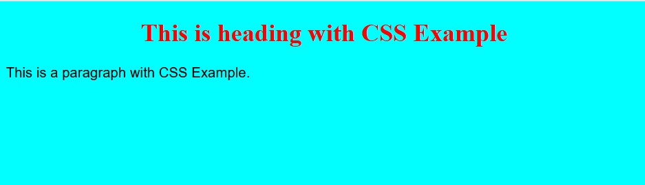
CSS defines the style of an HTML webpage. It is a language that allows us to control the behaviour of an HTML webpage. It specifies how the HTML content will be displayed on the screen.

CSS governs the layout of many HTML web pages. CSS is an abbreviation for Cascading Style Sheet.

Q. List all of the CSS modules that are currently in use.

CSS has several modules, which are listed below:

  • Selectors
  • Box Model
  • Backgrounds and Borders
  • Text Effects
  • 2D/3D Transformations
  • Animations
  • Multiple Column Layout
  • User Interface.

Q. Differentiate between CSS2 and CSS3.

The following are the distinctions between CSS2 and CSS3:

  • CSS3 is divided into two sections, each of which is referred to as a module. In CSS2, however, everything merges into a single document containing all of the information.
  • CSS3 modules are supported by almost all browsers, whereas CSS and CSS2 modules are not supported by all browsers.
  • Many graphics-related characteristics, such as border-radius and box-shadow, have been introduced in CSS3.
  • A user can specify multiple background images on a webpage in CSS3 by using properties such as background-image, background-position, and background-repeat.

Q. Describe the various types of CSS.

CSS is classified into three types, as listed below:


  • External: These are written in their own files.
  • Internal:Β These are referenced at the top of the web page code document.
  • Inline: These are written inside to tag.

Q. What is the purpose of the external style sheet?

Answer: An external style sheet is very useful because it contains all of the styling codes in a single file that can be used anywhere by simply referring to the link to that external style sheet file.

So, if we make changes to that external file, the changes will be reflected on the webpage. As a result, we can conclude that it is extremely useful and simplifies your work when working on larger files.

Q. What is the purpose of an embedded style sheet?

Answer: An embedded style sheet allows us to define styles in a single location in an HTML document.

We can generate multiple classes to use on multiple tag types of a web page using an embedded style sheet, and there is no additional downloading required for importing the information.


Q. How do I use a CSS selector?

Answer: We can choose which content to style by using the CSS selector, which acts as a link between the style sheet and the HTML files.

CSS selector syntax is “select” HTML elements based on their id, class, type, and so on.

Q. Describe the concept of Tweening.

Tweening is the process of creating intermediate frames between two images in order to achieve the appearance of the first image, which develops into the second image.

It is primarily used to create animation.

Q. Describe CSS image scripts.

CSS image scripts are a collection of images that are combined into a single image. While projecting multiple images into a single web page, it reduces the load time and number of requests to the server.

Q. Define the term Responsive web design.

Answer: It is a method in which we design and develop a web page based on user activities and conditions that are based on various components such as screen size, portability of the web page on different devices, and so on. It is accomplished through the use of various flexible layouts and grids.

Q. What exactly are CSS counters?

CSS counters are variables that can be incremented by CSS rules to keep track of how many times a variable has been used.

Q. What exactly is CSS specificity?

CSS specificity is a score or rank that determines which style declaration must be applied to an element. (*) While ID selectors have high specificity, this universal selector has low specificity.

CSS authorises the specificity level of the selector through four categories.

  • IDs
  • Inline style
  • Classes, Attributes, and pseudo-classes.
  • Elements and pseudo-elements.

Q. How do we calculate specificity?

To calculate specificity, we will begin with 0, then add 1000 for each ID, and then add 10 to the attributes, classes, or pseudo-classes with each element name or pseudo-element, and finally add 1 to them.


Q. How do we create a rounded corner with CSS?

Answer: Using the “border-radius” property, we can create a rounded corner. This property can be applied to any element.


Q. How will you insert border images into an HTML element?

Answer: We can use the CSS property “border-image” to set the image to be used as the border-image alongside an element.


Q. In CSS, what are gradients?

It is a CSS property that allows you to display a smooth transformation between two or more specified colours.

Gradients are classified into two types in CSS. They are as follows:

  • The Linear Gradient
  • Gradient Radial

Q. What exactly is CSS flexbox?

It enables you to create a flexible responsive layout structure without using any CSS float or positioning properties. To use CSS flexbox, you must first define a flex container.


Q. List all of the flexbox’s properties.

Answer: The flexbox has several properties that are used in the HTML webpage.

They are as follows:

  • flex-direction
  • flex-wrap
  • flex-flow
  • justify-content
  • align-items
  • align-content

Q. How do I align an image vertically in a division that spans the entire width of the webpage?

Answer: We can use the syntax verticle-align: middle in the div1> element, as well as bind the two text spans around with another span and then use verticle-align: middle in the content #icon.

Q. What is the distinction between padding and margin?

Answer: The margin property in CSS allows us to create space around elements. We can even create space outside of the defined borders.

The margin property in CSS is as follows:

  • margin-top
  • margin-right
  • margin-bottom
  • Margin-left

As shown below, the Margin property has some defined values.

Auto – The margin is calculated using this property browser.
Length – It specifies the margin values in px, pt, cm, and so on.
% – It specifies the element’s width%.
Inherit – We can inherit the margin property from the parent element using this property.

Padding is a CSS property that allows us to create space around an element’s content as well as inside any known border.

CSS padding has additional properties such as,

  • Padding-top
  • Padding-right
  • Padding-bottom
  • Padding-left

Padding cannot contain negative values.

Q. What is the Box Model in CSS used for?

The box model in CSS is a box that binds all HTML elements and includes features such as margins, border, padding, and the actual content.

We will have the authority to add borders all around the elements if we use a box model, and we will also be able to define the space between the elements.

Q. How do we add icons to our website?

Answer: We can use an icon library such as font-awesome to add icons to an HTML webpage.

Any inline HTML element must contain the name of the given icon class. I or span>). Icons in icon libraries are vector scalable images that can be styled with CSS.

Q. What exactly is a CSS pseudo-class?

It is a class used to define a specific state of an HTML element.

This class can be used to style an element when a user hovers over it, as well as to style an HTML element when it receives focus.

Q. Explain the concept of CSS pseudo-elements.

It is a CSS feature that is used to style the specified parts of an element.

We can, for example, style the first letter or line of an HTML element.

Q. What exactly is CSS opacity?

It is the property that elaborates on an element’s transparency.

We can use this property to make an image transparent, with values ranging from 0.0 to 1.0. The image is more transparent if the value is lower. IE8 and earlier browser versions can accept values ranging from 0-100.

Q. List all of the CSS position states.

In CSS, there are four position states, as shown below:

  • Static(default)
  • Fixed
  • Relative
  • Absolute

Q. What are CSS navigation bars?

Answer: Using navigation bars, we can transform a standard HTML page into a more user-specific and dynamic web page. Because it is essentially a list of links, the use of the ul> and li> elements makes perfect sense.

In CSS, what is the difference between relative and absolute?

The main distinction between relative and absolute is that “relative” is used for the same tag in CSS, which means that if we write left:10px, the padding will shift to the left by 10px, whereas absolute is completely relative to the non-static parent.

That is, if we write left:10px, the result will be 10px away from the parent element’s left edge.

Q. Define ‘important’ CSS declarations.

Answer: An important declaration is a declaration that is more important than a normal declaration.

During execution, these declarations take precedence over less important declarations.

For example, if two users have important declarations, one of them will override the declaration of the other user.

As an example:

Body {background: #FF00FF !important; color: blue}

In this body, the background is more important than the colour.

Q. Describe the various cascading methods that can be used within the cascading order.

Answer: Cascading order is a sorting method that allows for a variety of other sorting methods:

a) Sort by origin: There are some rules that can provide an alternate way, which are as follows:

The increased weight of the user’s style sheet will override the normal weight of a specific provider’s style sheet.
The normal width of the provider’s style sheet will override a specific user’s stylesheet rules.

b) Sort by the specificity of the selector: The less specific selector is overridden by the more specific selector.

For example, a contextual selector is less specific than an ID selector, which is more specific, and the ID selector overrides the contextual selector.

c) Sort by specified order: This occurs when the two selectors have the same weight and other properties than the specification that will be seen for overriding.

Example:

If the style attribute is used for inline style, all other styles will be overridden.

Furthermore, if the link element is used for external styling, the imported style will be overridden.

Q. Distinguish between inline and block elements.

Answer: An inline element does not have a width and height element, nor does it have a line break.

For instance, em, strong, and so on.

Block element definition:

  • They have a line break.
  • They define width by specifying a container and also allow for height customization.
  • It may also include an element that appears in the inline element.

Example:

width and height max-width and max-height\smin-width and min-height\shi (i=1-6)- heading element\sp- Paragraph element.

Q. How does the concept of inheritance play a role in CSS?

Answer: Inheritance is the concept of a child class inheriting the properties of its parent class. It is a concept used in many languages and is a quick way to define the same property again.

In CSS, it is used to define the hierarchy from the top to the bottom. If the child uses the same name as the inherited property, the children’s class can override it.


Q. Distinguish between the ID and the class.

Answer: ID and class are both used in HTML to assign values from CSS.

Please see the differences below:

  • The ID is a type of element that uniquely assigns a name to a specific element, whereas the class is an element with a specific set of properties that can be used for the entire block.
  • The ID can be used as an element because it can uniquely identify it, whereas class is defined to block elements and apply excessive tags wherever it is used.
  • ID restricts the use of its properties to a single element, whereas class applies inheritance to a specific block or group of elements.

Color Picker

Color Picker tool

Color Picker is a tool that helps designers and artists to choose the right color for their projects. It is a powerful tool that enables users to pick colors from different sources like images, websites, and even physical objects. With the help of Color Picker, users can easily create harmonious color palettes for their designs. Moreover, it can also be used to accurately match colors from existing sources such as logos, brand guidelines, and photographs. By using Color Picker, designers are able to create visually appealing designs in no time.


HTML color name with hex code (A to Z) list

CSS Tutorial

CSS is the language we use to add style to an HTML document. CSS tells how HTML elements should look on the screen.

This tutorial will teach you everything you need to know about CSS, from the basics to more advanced techniques.

The CSS tutorial or CSS 3 tutorial teaches both the basics and more complex ideas about CSS technology. Our CSS tutorial is made for both newbies and experts.

Here are the most important parts of CSS:

  • Cascading Style Sheet is what CSS stands for.
  • HTML tags are made with CSS.
  • CSS is a language that is used a lot on the web.
  • Web design uses HTML, CSS, and JavaScript. It makes it easier for web designers to style HTML tags.

Example

<!DOCTYPE html>
<html>
<head>
<style>
body {
background-color: #00FFFF;
}

h1 {
color: red;
text-align: center;
}

p {
font-family: arial;
font-size: 18px;line-height:24px
}
</style>
</head>
<body>

<h1>This is heading with CSS Example</h1>
<p>This is a paragraph with CSS Example.</p>

</body>
</html>

Output

css example